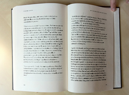

Every time you make a PDF, the fonts from your document embed as subsets of the original font. The subsets lack the kerning information and other data for proper layout, and are therefore of little value to anyone extracting them in hope of acquiring a font for free, not unlike a store attaching ink tags to clothing to make them less desirable to thieves.
A few years ago, Ben wrote some code that collected these misshapen font parts, but unable to find a good use for them, he filed away the project for later. The thought “one day I’ll use this” can either turn you into a pathological hoarder or someone who pulls off creative projects so, luckily, Ben finally met what seems to be the saving grace for many projects: the right story at the right time.
When Kazuo Ishiguro began Never Let Me Go, he wrote for years about teenagers in a boarding school. He kept abandoning them for other stories, until one day he heard a radio program about advances in biotechnology. This inspired his driving force: the kids were clones, bred to be organ donors.
Never Let Me Go, like other stories touching the theme of responsibility for something we made that now has a life of its own, owes something to Mary Shelley’s Frankenstein. Frankenstein in turn owes Paradise Lost and Greek mythology (Titan Prometheus stealing fire from the Gods and giving it to man) for its theme, but the man-made setup was inspired by early nineteenth-century science, which is why the book is often considered to be the first science fiction novel. Another innovation: in Frankenstein, you root for the monster, not its human creator.
In perhaps the most heartbreaking sequence of the novel, the monster camps outside a cabin in the woods from where it eagerly follows the life of a poor family. He eavesdrops on their conversations and practices his own speech. He takes to their personal dramas and questions his own lack of family relations. He feels their pain, cares for their struggles, and, at night, helps them with chores for which his monster size and strength is handy. When he finally approaches the family and they reject him, Frankenstein’s monster becomes the bully who really just wanted to belong.
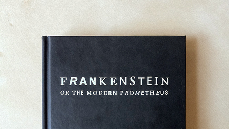
But it’s by no means a slasher plot from here. Nowadays the novel can be a bit tedious to read at times, but as a story — the monster’s journey of loneliness, love of one’s creator, innocence and sacrifice — it is timeless. Almost two hundred years old, the story contains enough universal themes to continuously inspire writers, filmmakers, animators —and designers. Frankenstein served as the perfect vehicle for Ben's Frankenfont.
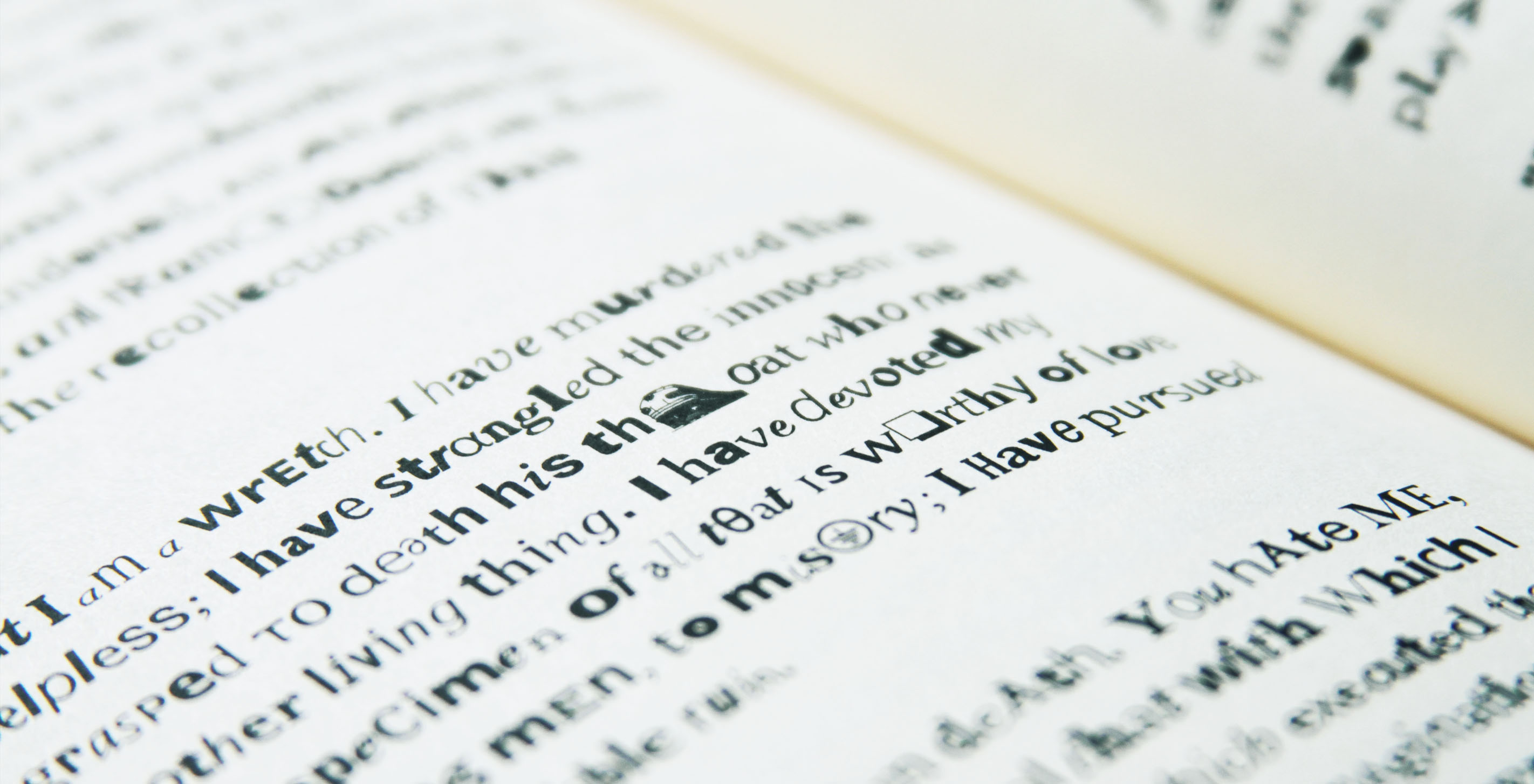
The typeface itself tells a story of how different fonts are used in office documents. The frequency of the letter from each font is calculated proportionally to how often that font occurs in a PDF. (This says something about how often people disregard design sensibilities and spiff up their presentation with Comic Sans.) In the published piece, the arrangement of these letters reflects the progression of the Frankenstein narrative.
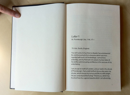
The beginning of the book, as Victor Frankenstein peacefully corresponds with his family, is visually calm, comprised largely of Arial, Helvetica, and the occasional Times New Roman (the by far most common fonts used in documents).
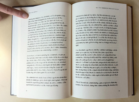
By pages 60 and 61, Arial Bold and Times Italic enter the story.
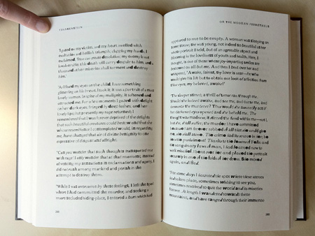
In the 200s, commonly used script fonts and more obscure faces begin to appear.
Towards the end, as the story dips deep into rage and despair, the pages crawl with non-Roman fonts, highly specialized typefaces, and even pictogram fonts, sometimes giving the story the feel of a Disney-style swearword.
The whole book is surprisingly readable, with the font emphasizing tone. “I will be with you on your wedding night” or:

...set with a mix of fonts, adds a dimension of anguish.
For those interested, you can purchase a hardcover version of the final book. As with some of the other items we sell online, we're donating the proceeds. Our first round of profits were given to Donors Choose to buy books for students, which seemed apt given the nature of the project.
The making of Frankenfont
The technical side of Frankenfont came about because of a fascination with the way that PDF files contain incomplete versions of fonts. When a piece of software (Acrobat Distiller, or the PDF driver, or the Mac OS printing system, etc.) creates a PDF, shape data of high enough quality to reproduce the original document is embedded. However, only the necessary characters (and little of the font's “metrics” that are used for proper typographic layout) are included in the PDF. This is what prevents others from extracting the fonts to be used for practical purposes.
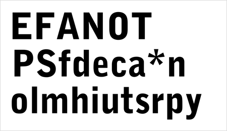
For each of the 5,483 unique words in the book, we ran a search (using the Yahoo! Search API) that was filtered to just PDF files. We downloaded the top 10 to 15 hits for each word, producing 64,076 PDF files (some were no longer available, others were duplicates). Inside these PDFs were 347,565 subsetted fonts. From those fonts, 55,382 unique glyph shapes were used to fill the 342,889 individual letters found in the Frankenstein text.
The initial code calculated how often different fonts are found in PDFs from internet searches. Next, it lined up all 342,000 letters in the book into one long list. Then, if the lowercase "e" from Arial is three percent of all the letter "e"s found in fonts in the PDF files, the first three percent of all the lowercase "e"s in the list of 342,000 will be set to that same Arial "e." It continues setting each character like this based on usage, eventually getting down to the really odd things (that rarely appear in PDFs) toward the end and voila — a:

We’d love to hear what you’re working on, what you’re curious about, and what messy data problems we can help you solve. Drop us a line at hello@fathom.info, or you can subscribe to our newsletter for updates.
