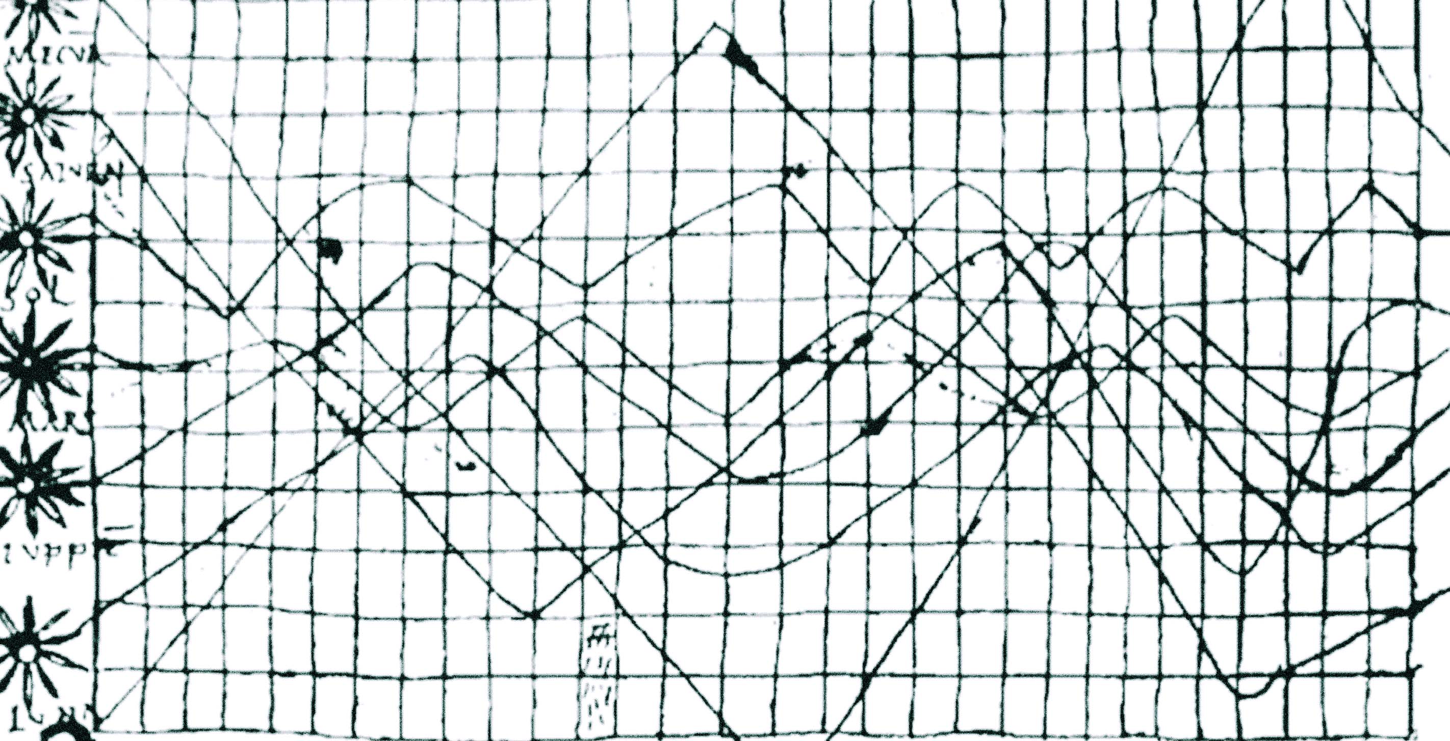

Mark’s point on interactivity in data visualization states that a display needs to be interactive if a changed view lets the audience focus on the analyses rather than the data.
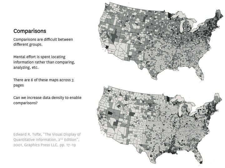
It’s a principle often ignored. Even when a designer exports the data into visual expressions, the viewer still often has to spend energy locating comparable data sets.
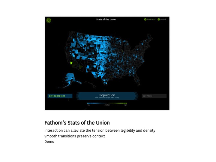
While in the example below, by making data from the Community Health Status Indicators (CHSI) report available in a single-screen interface for the iPad app Stats of the Union, the viewer can change perspectives while preserving the context.
Mark also gave the "why this, why now" of data visualization.
Visualization has long been simply a practical method for communicating information. The effort to tease meaning out of data sets and show it visually — be it uncharted coasts, human behavior, or balls of light traversing the night sky, is not new.
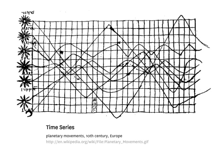
But this is why companies and the public pay more attention to the field:
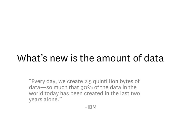
Mark detailed the process of how analysts, developers, and designers establish relationships between numbers, images, and text in order to fit them into an interactive app that preserves meaning and is simple to use.
A week after hearing his perspective, one thought in particular had stayed with me:
Insights are expensive.
Once the work is done, an insight may appear simple. But the effort that someone went through to acquire them was far from.
An expensive insight, once truly understood, can often be extremely concentrated. It's the sub-clause that sums up a writer’s understanding of how Russian literature affected the Western voice — precisely what the story needs — versus the cheap effort of filling two paragraphs with notes on a late morning. An expensive insight may add just a small part: a slice of a three million year old bone extracted from the Ethiopian desert, cleaned, analyzed, and fitted into context — Lucy — by a patient archeologist.
Once simplicity is reached, a design looks obvious, even banal. Of course it's done this way! It's almost annoying. But with the aim on clarity, one should never show off the effort. Showing off effort tends to inspire design that may look intriguing but is about as instructive as its real life equivalent:
Hairballs.
We’d love to hear what you’re working on, what you’re curious about, and what messy data problems we can help you solve. Drop us a line at hello@fathom.info, or you can subscribe to our newsletter for updates.
