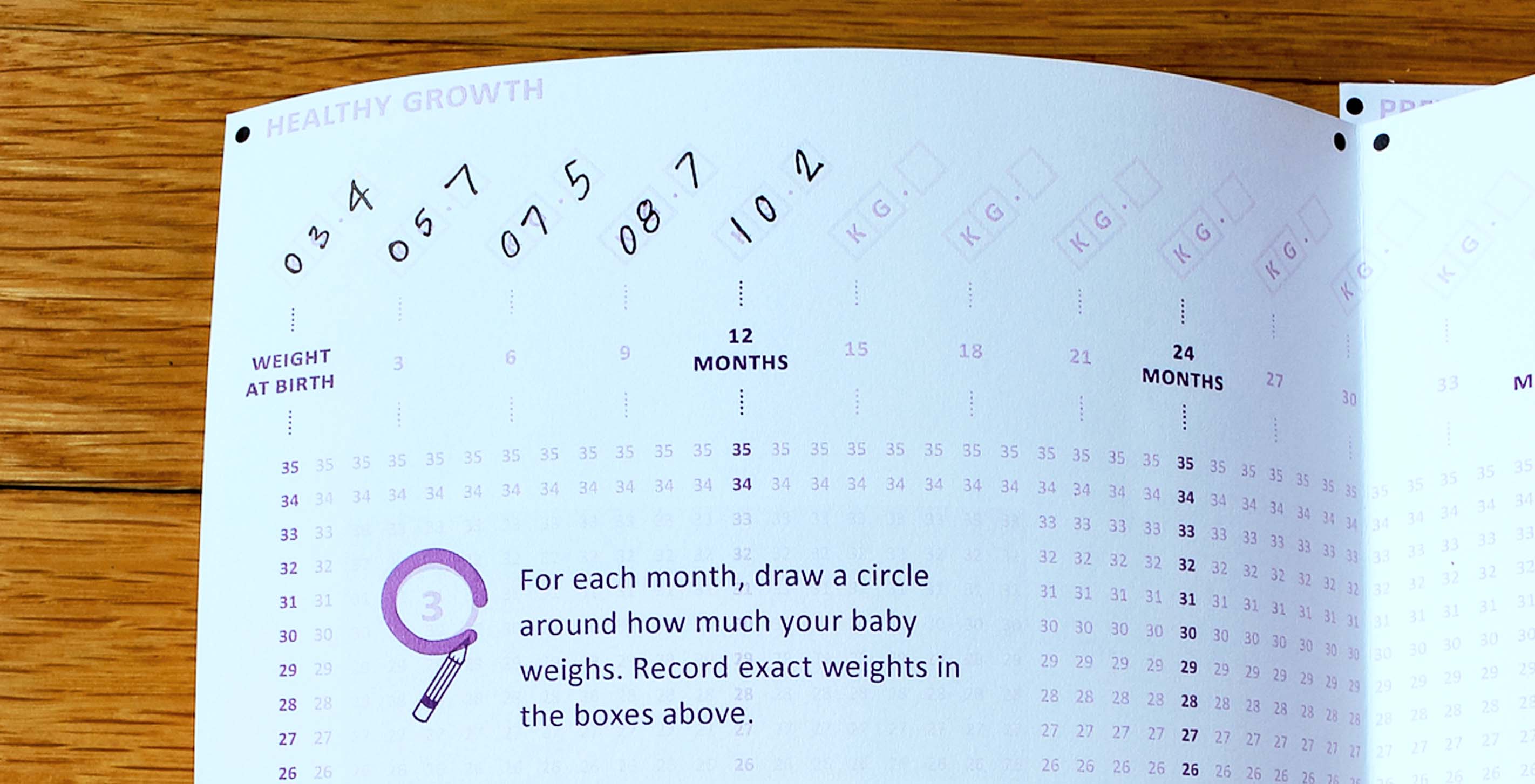
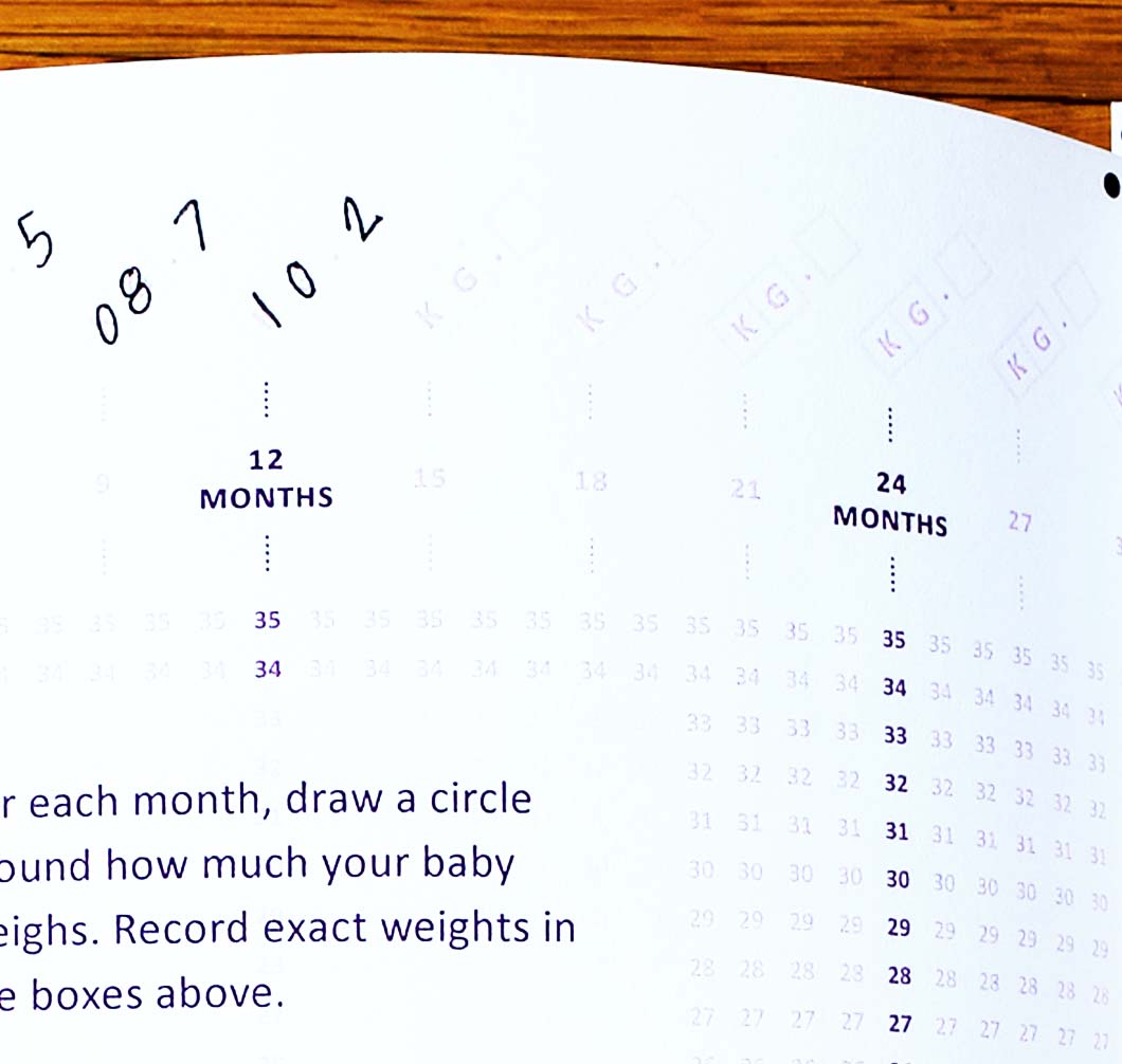
It should come as no surprise that we spend a lot of time geeking out over data. Unless we're busy watching movies, you'll find us exploring existing datasets, and working towards a clear and compelling visual representation of the stories we find inside. Reimagining the child health record as a part of last year's Records for Life contest offered an exciting opportunity to apply those same design concepts to the input mechanisms themselves — both digital and analog — in order to increase the volume and accuracy of global health data.
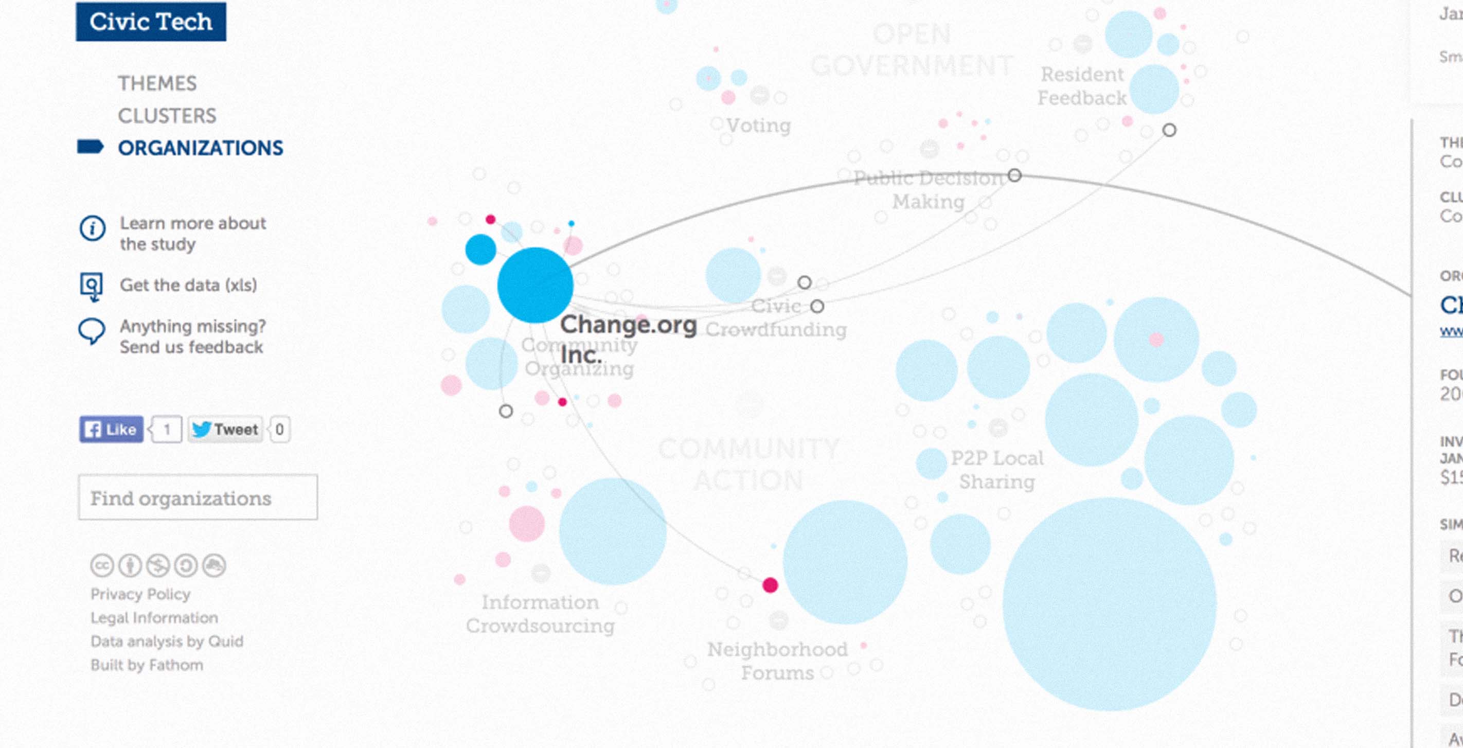

Hot off the presses! Our latest project with the Knight Foundation went live today. Trends in Civic Tech is an interactive tool for exploring the rapidly growing field of "civic tech" — organizations and companies operating at the intersection of technology, open government, and citizen engagement.


In September we were honored that Connected China was named a finalist in the 2013 Fast Company Innovation by Design Awards.

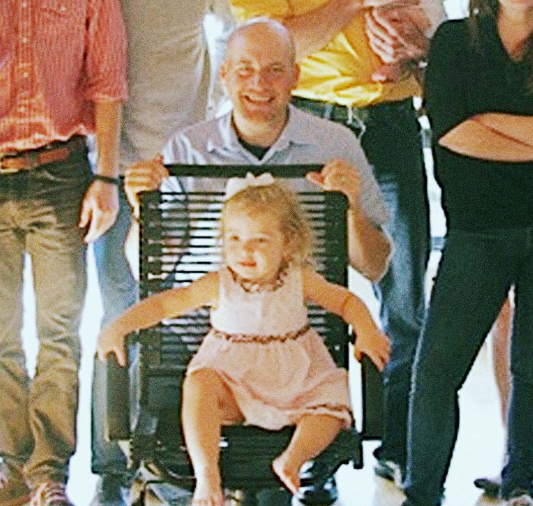
We all loved it when James brought his family to visit the office this summer — especially when his oldest daughter Joy took a particular shine to the Big Chair:


Last week we were lucky to be able to welcome Dan Shiffman to the Fathom offices for a full day of Processing workshops. Dan is a professor at the Interactive Telecommunications Program program at NYU, and is the author of Learning Processing and Nature of Code. (As far as we know, he is also our first guest to commute to the office via ferry from Maine.)


When I was in graduate school, I took a type design elective taught by the excellent Cyrus Highsmith. The first week we each gathered and refined the basic formal elements that would define the nature of our typeface. In my case, I wanted a display face optimized for the screen — with rounded slab serifs, a roomy x-height for readability, and bowls with a distinctive tear shape to them. What emerged was Shoestring, a "simple, friendly, open type face for blogs. Suitable for boilerplates and headlines. Optimized for use on screen."
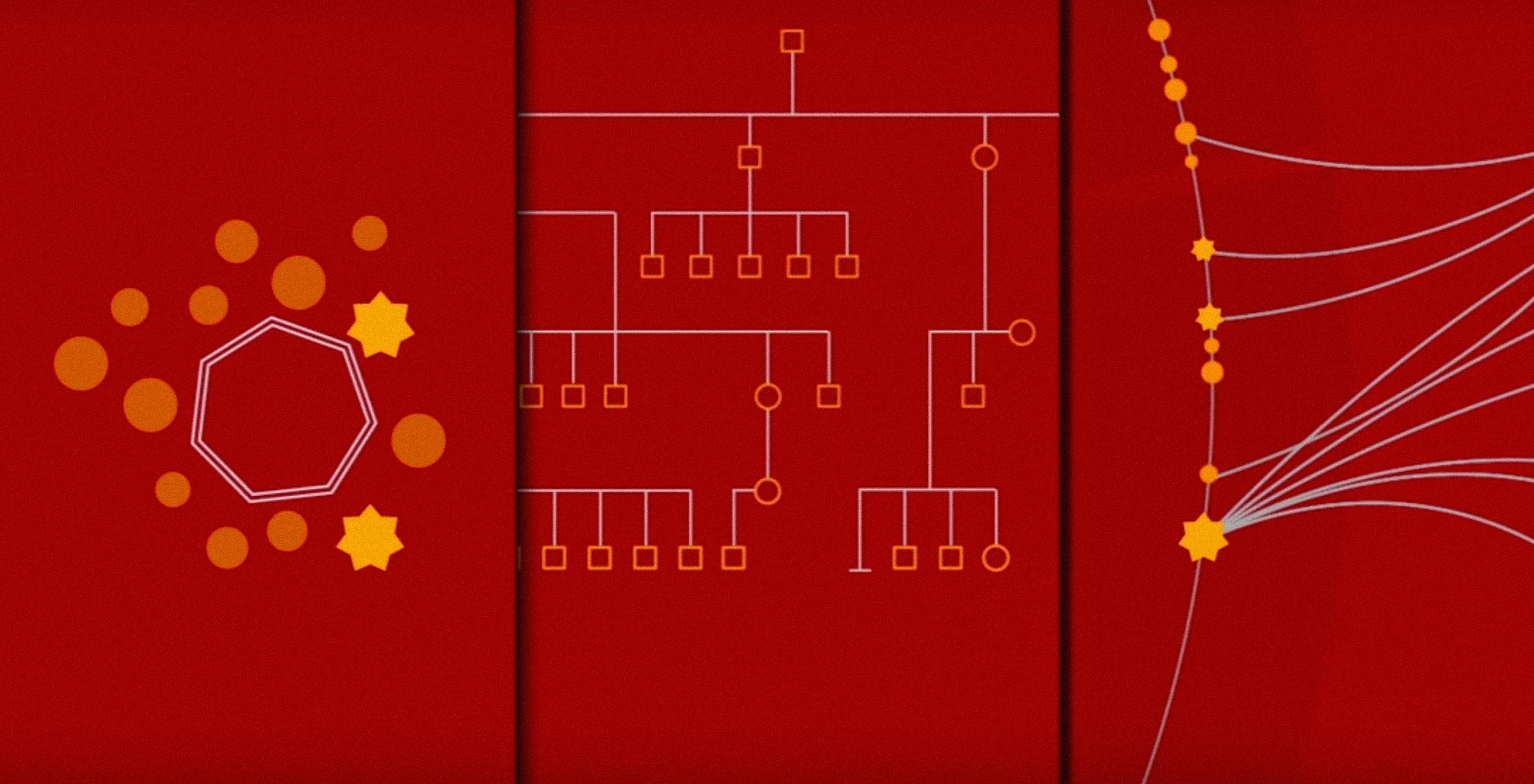
We are almost one week into the launch of Connected China! One notable discovery has been the early audience indicators: much of the site's traffic has come from within mainland China, and a majority of visitors worldwide are using browsers that have the zh-cn character encoding (suggesting Chinese language computers). This response is surprising given that the site seems to be at least partially blocked in China, with reports of blocked tweets and weibos (Weibo is a Chinese micro-blogging site) cropping up even earlier.


She has written over 200 books, over 100 of which were New York Times best sellers, has an astounding 280 million books in print, and is credited with bringing romance novels into the modern age — filling their interiors with capable and intelligent women, and filling their covers with a notable lack of, well, you know.


We left our posts at the Fathom offices just as the MBTA suspended service and a statewide driving ban went into effect — but not before setting up a camera and a tripod in the window to keep watch over our fair city as Nor'Easter Nemo arrived.
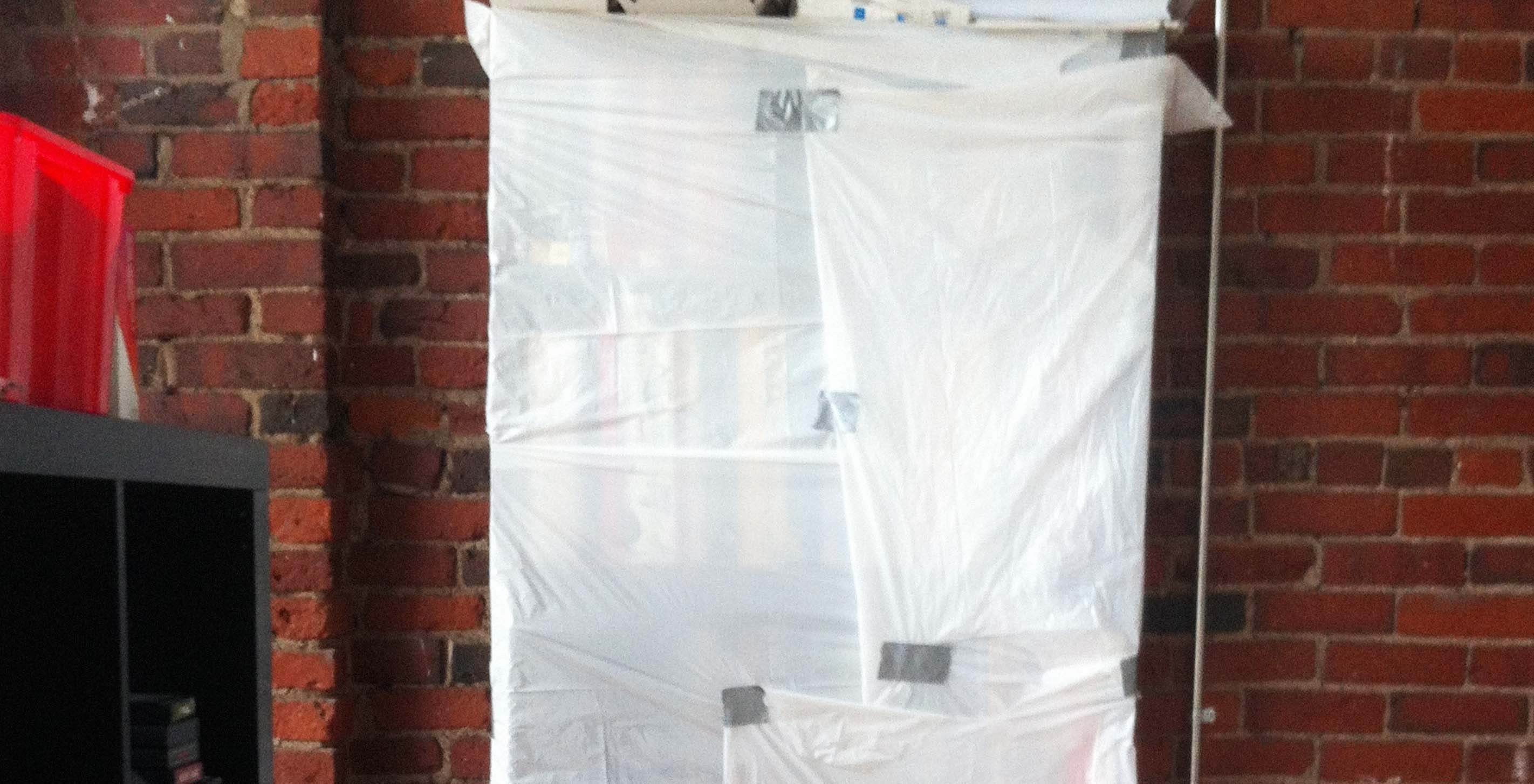
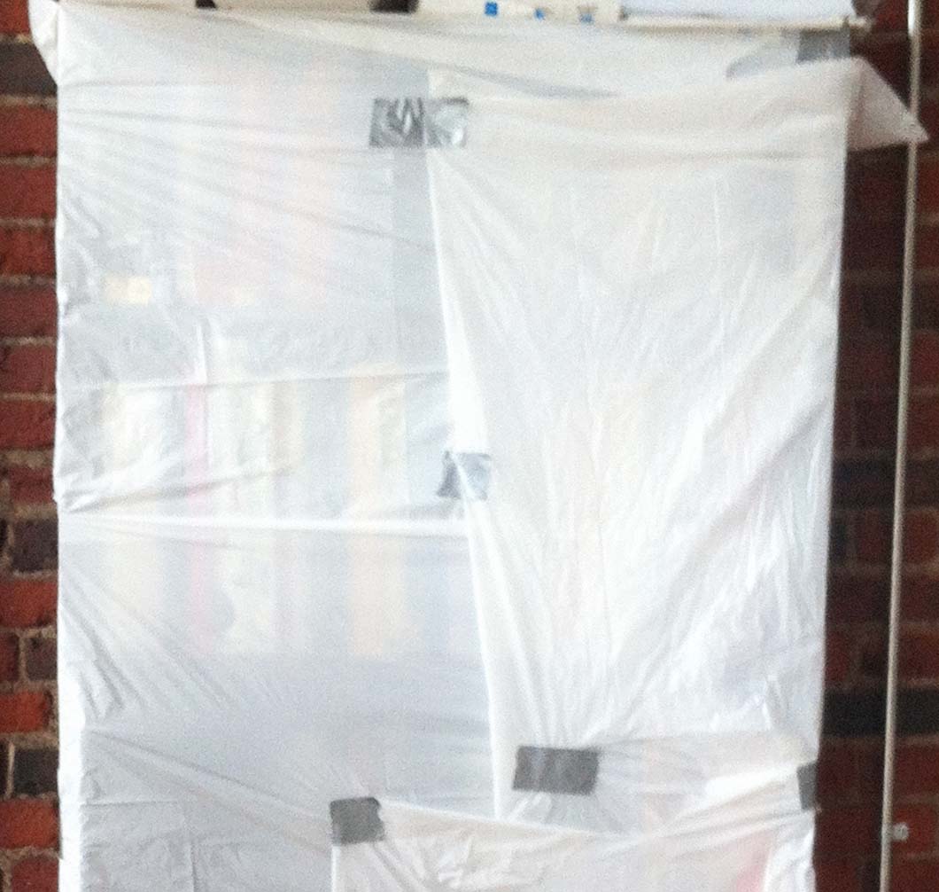
Fathom offices thankfully emerged unscathed from last night's super storm, and those regions that weathered the worst are in our thoughts today. In the event that Sandy came farther north, we took precautions over the weekend to make sure our most valuable assets were taken care of:
The good news is that our first run of All Streets posters got a ton of love this summer. The less good news is that we sold out of them, so James and Terrence ventured down to Connecticut yesterday to do press checks on the second run.
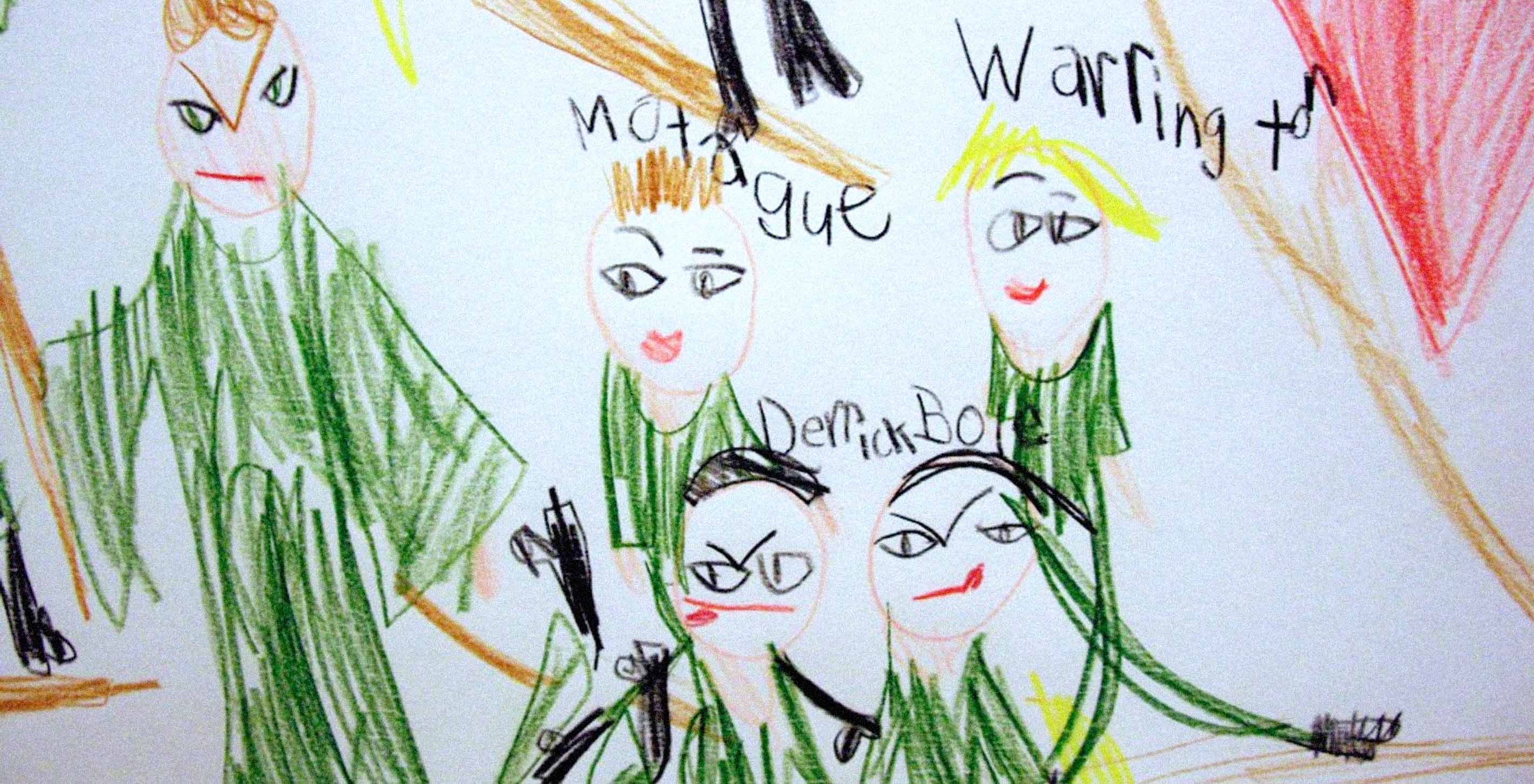
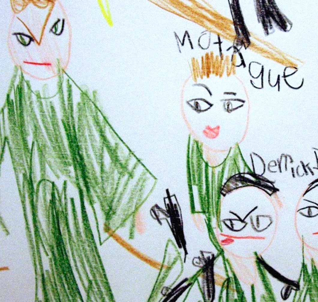
Our youngest data scientist has really evolved as an artist since we've known her, using the Fathom offices as a sometimes studio when she is not travelling. She is currently experimenting with large-scale figurative works on paper, exploring the tensions between data visualization and young adult folk iconography:
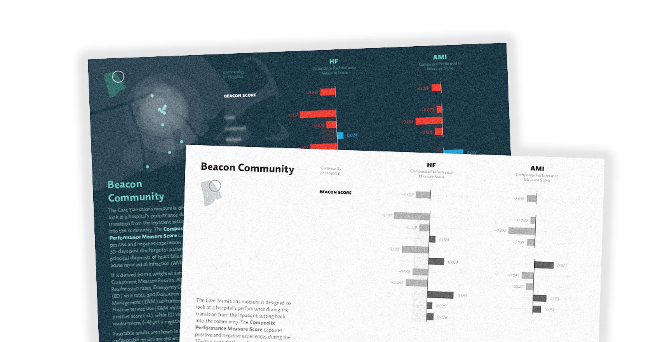
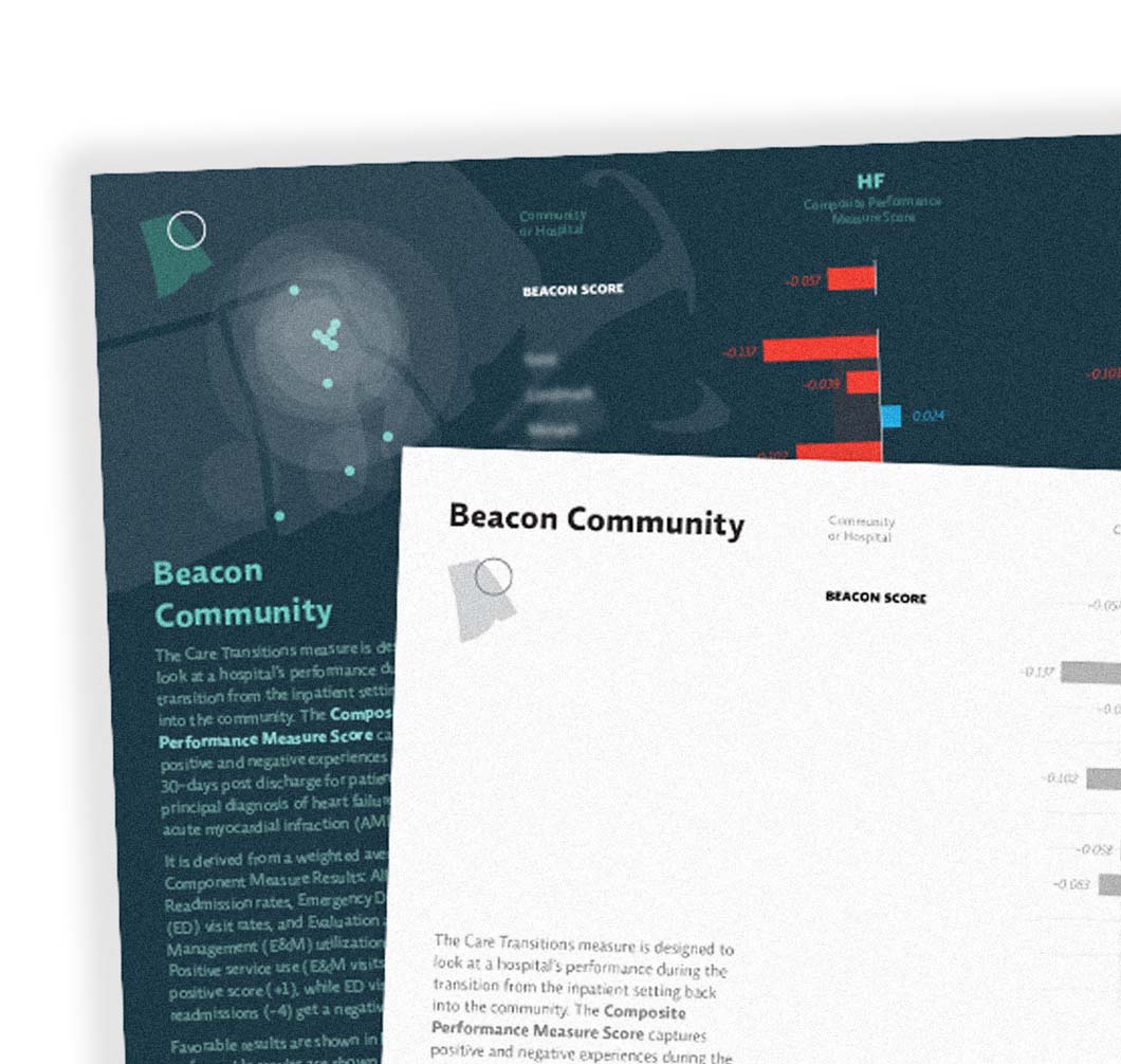
Here at Fathom we're all breathing sighs of relief, having just wrapped up a project that has been in progress for the last year or so. Sadly, you'll have to wait until January to see the fruits of that labor, but in the happy lull that comes after delivering a final product, we thought it was a good time to show off some other fun recent work!
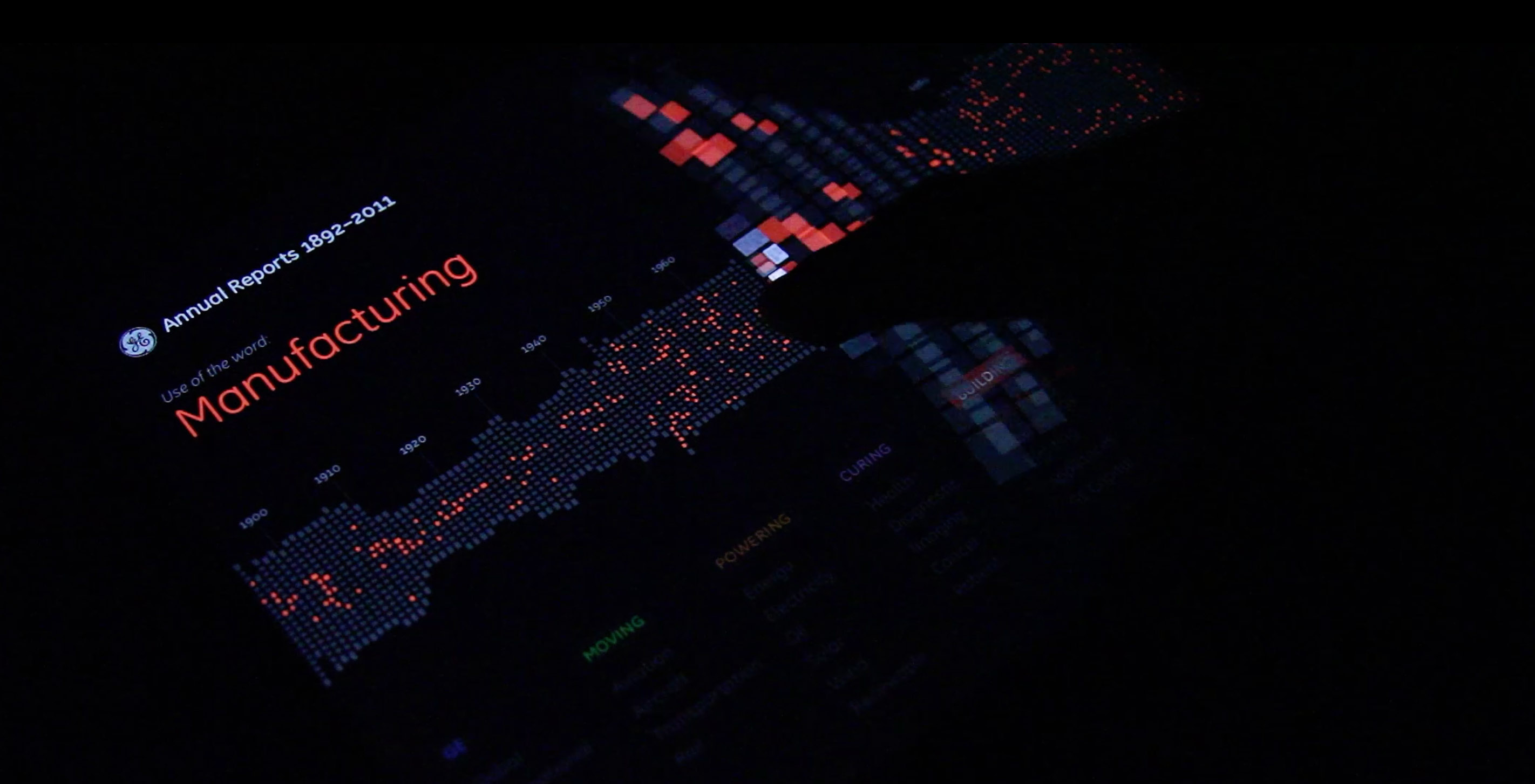

First it was an interactive touch installation. Then it was a web app. Now it's ready for the iPad! Head on over to iTunes to grab your (free!) version today.
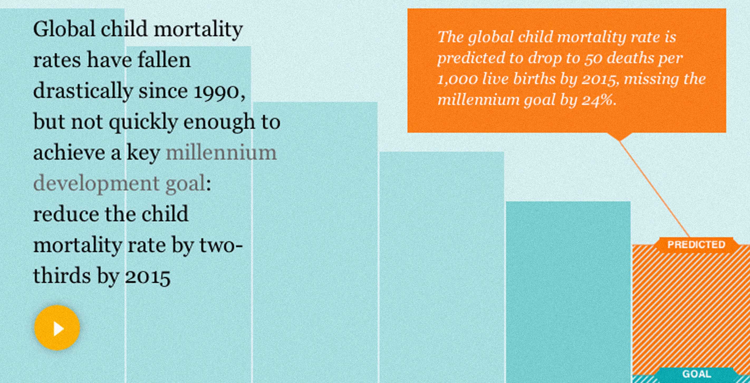

Our newest piece for the Gates Foundation — a visualization for the Guardian showing the current state of global child mortality — went live this morning!
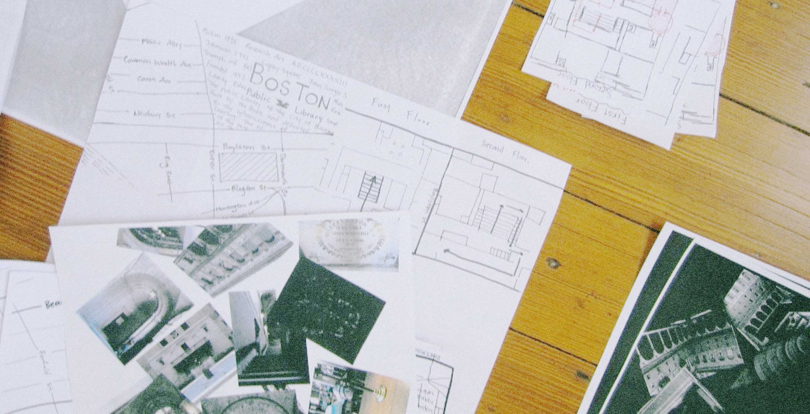
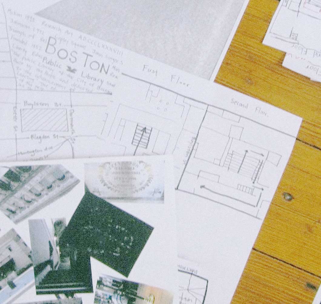
Not one to be outdone by Chris, I too welcomed an intern this summer! Dana's partner-in-crime Chensh was studying media at NYU and interested in design, and at first I wasn't sure what sort of skills we should focus on with such a short time together. Then she quoted Marshall McCluhan in our first meeting, and I knew we were in for something great.
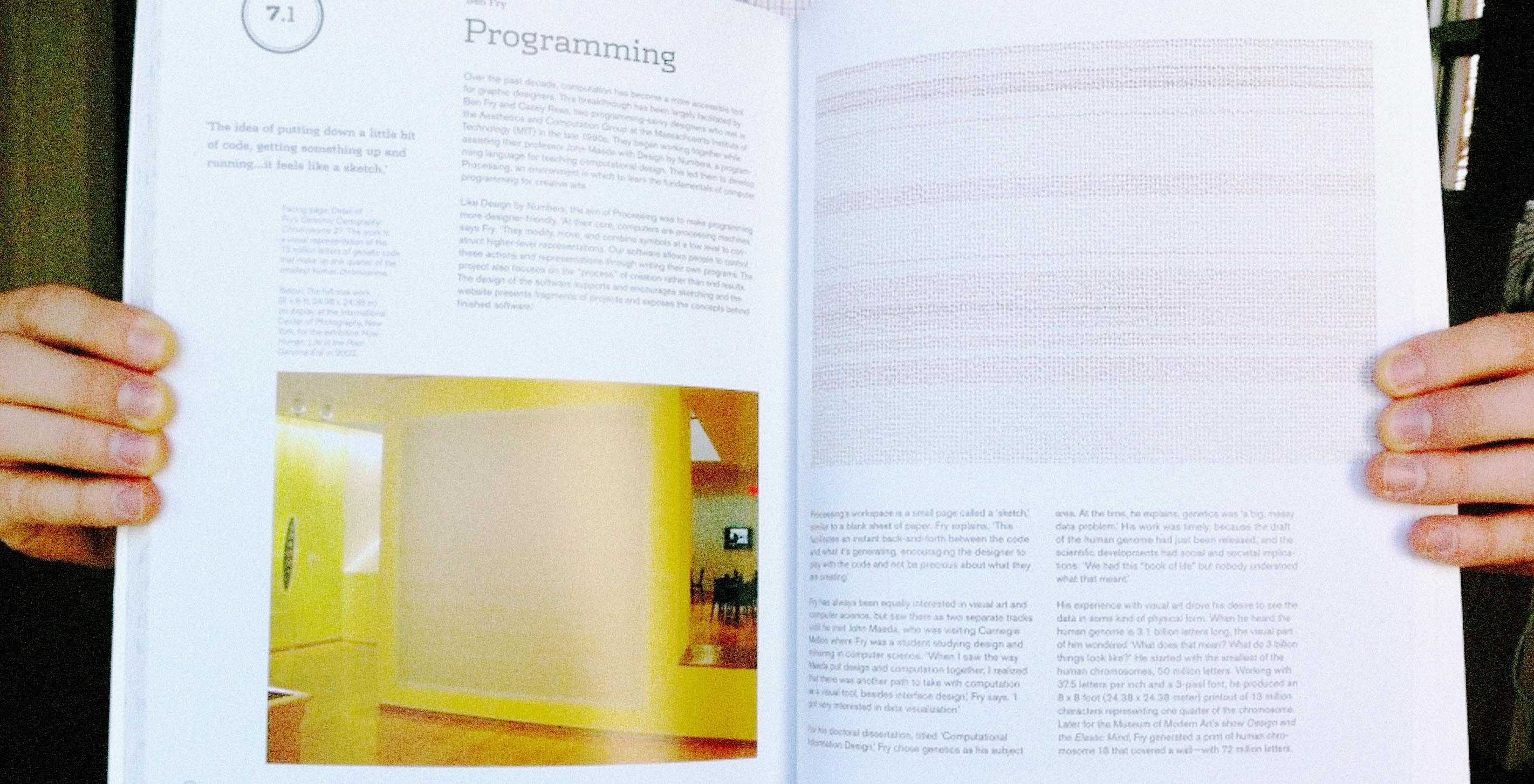
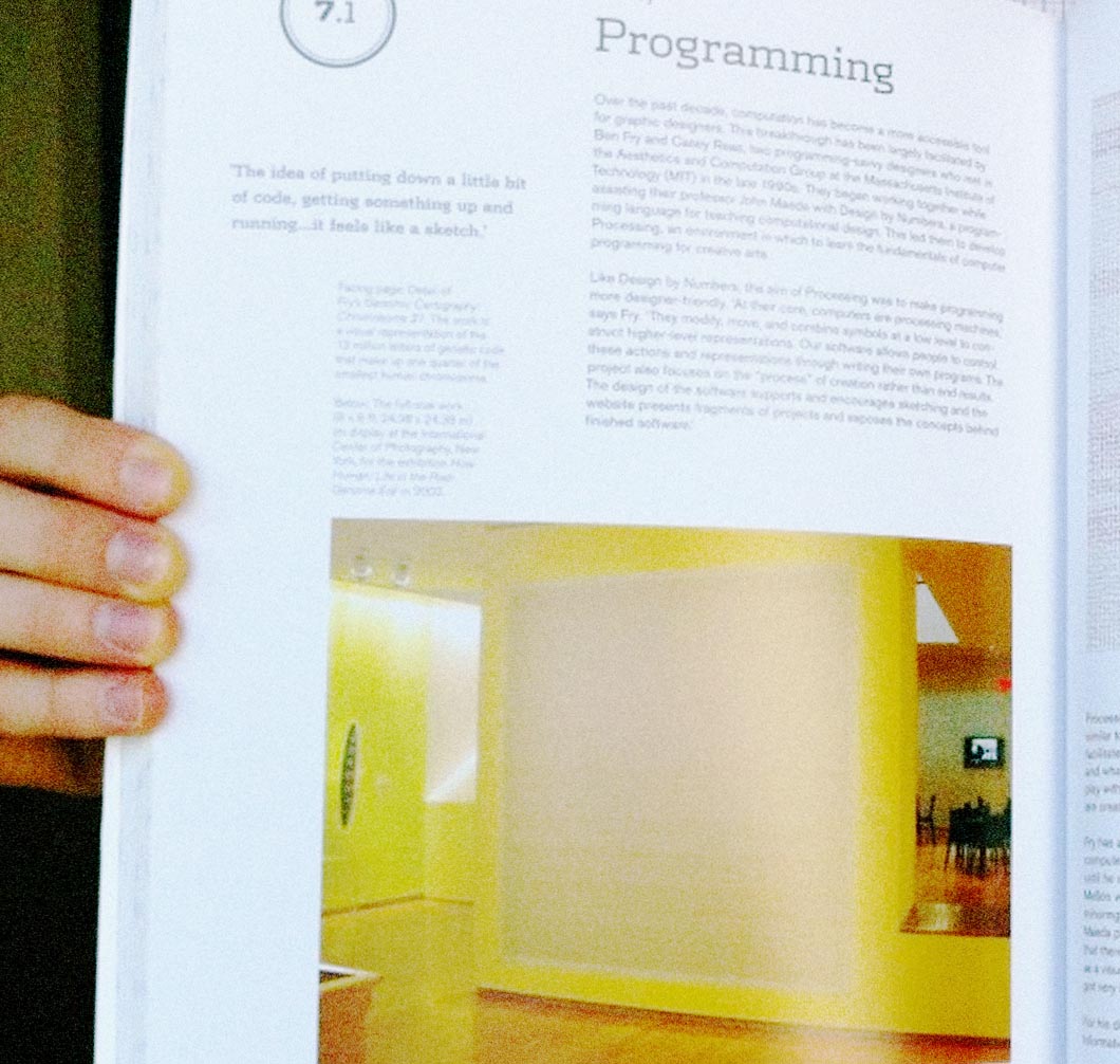
It's always a good day in the office when you get fun things in the mail, and this past week was no exception. Our favorite design and teaching duo Skolos-Wedell sent us an advance copy of their newest book, Graphic Design Process. Our newest designer Terrence immediately took it for a spin!
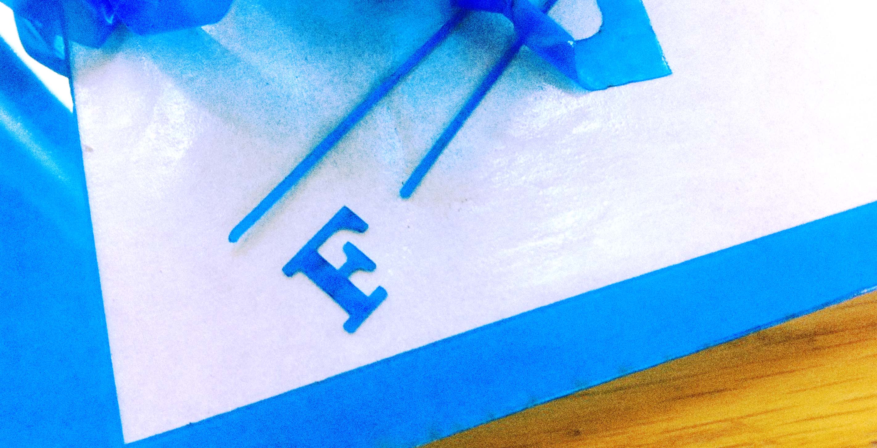
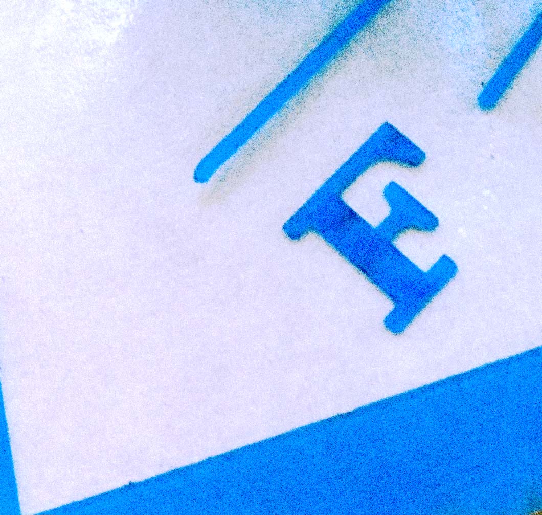
Do you ever have that overwhelming urge to design something tangible? Involving lasers? Me, too. Which is why I took a break from screens a few Fridays ago to toy around with a quick prototype and send it off to Ponoko. The idea was to have a handy stencil to quickly draw a thumbnail window at the correct proportion for an iPad, and at just the right scale for the grid inside a Moleskine Extra Large Squared Cahier (this designer's sketchbook of choice).
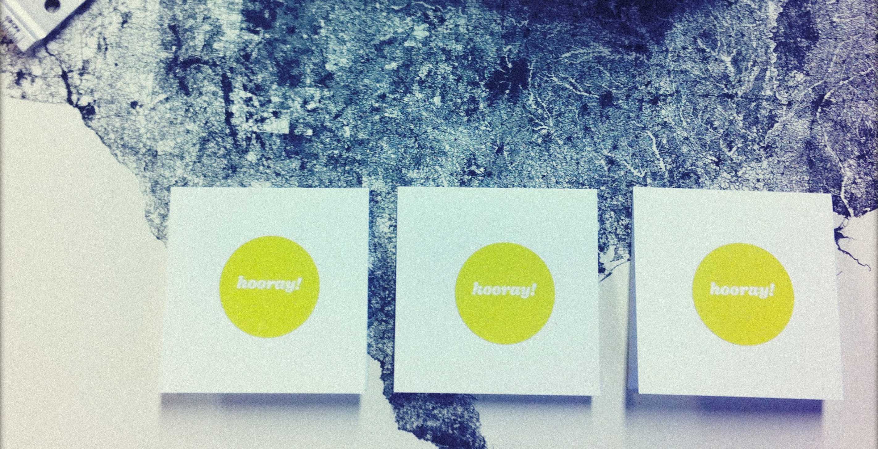
Scenes from the Fathom studio mailroom as we process our first batch of orders for the All Streets poster. Head over and grab yours while they last!


Last week a small Fathom delegation ventured to Washington, DC, for the Health Data Initiative Forum. More on that shortly.
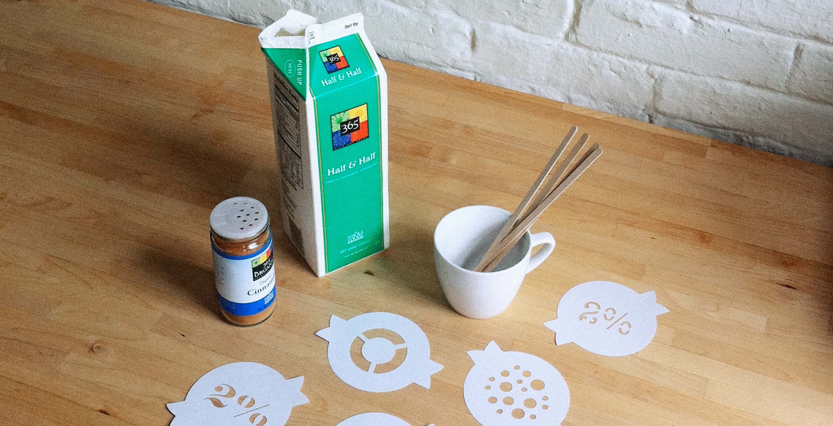
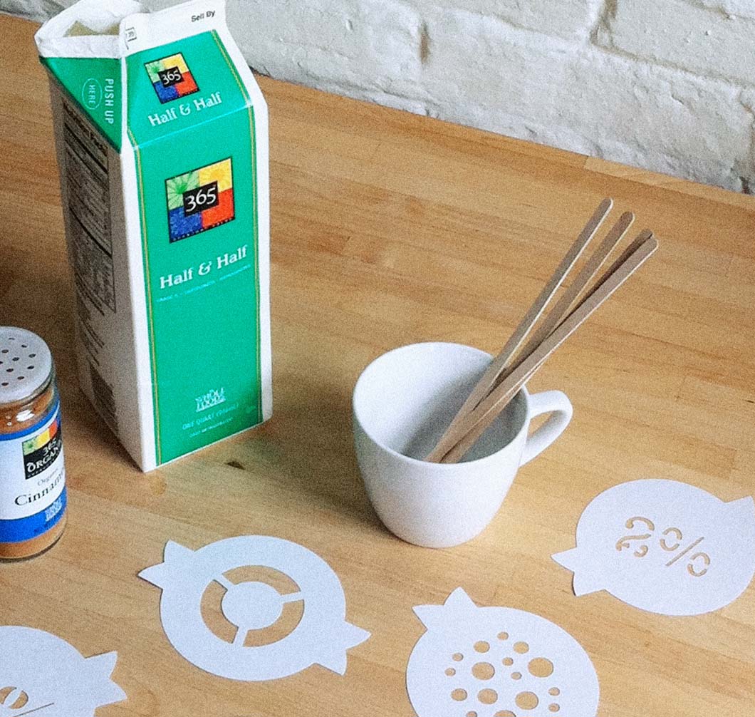
The Test Kitchen — a lesser known branch of the Fathom family — was established earlier this year in an attempt to explore the relationships between two of our favorite things: data and food. Inspired by a recent speaking engagement of Ben's, at which the organizers set up a coffee bar called the Data Vis Café, we spent the last few weeks contemplating what sort of things our coffee could (or would!) say to us if given the chance.
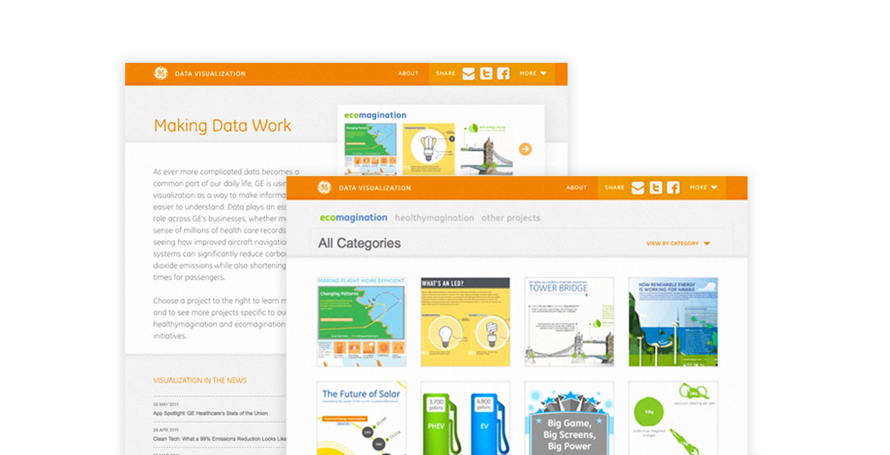

We gave a previous web design project a face-lift earlier this year — a rare luxury amid the rapid pace of design work these days. Since creating the site last year, GE has been amassing an inspiring collection of data visualization projects on their Making Data Work blog, and the expanding volume called for a slight update in layout and architecture.
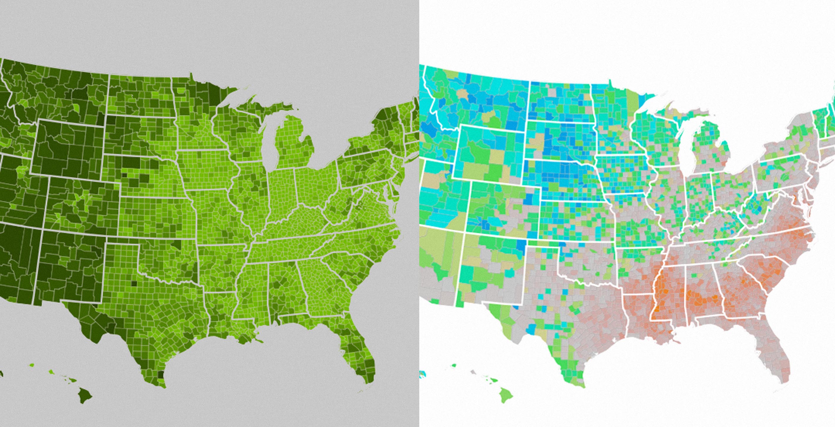
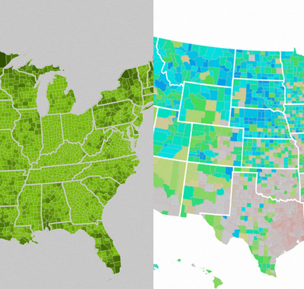
While building Stats of the Union, we went through a large heap of sketches. Some were mistakes. Others looked good, but didn't do the job. While a favorite design can be worthy of endless defense, more often—killing is key.
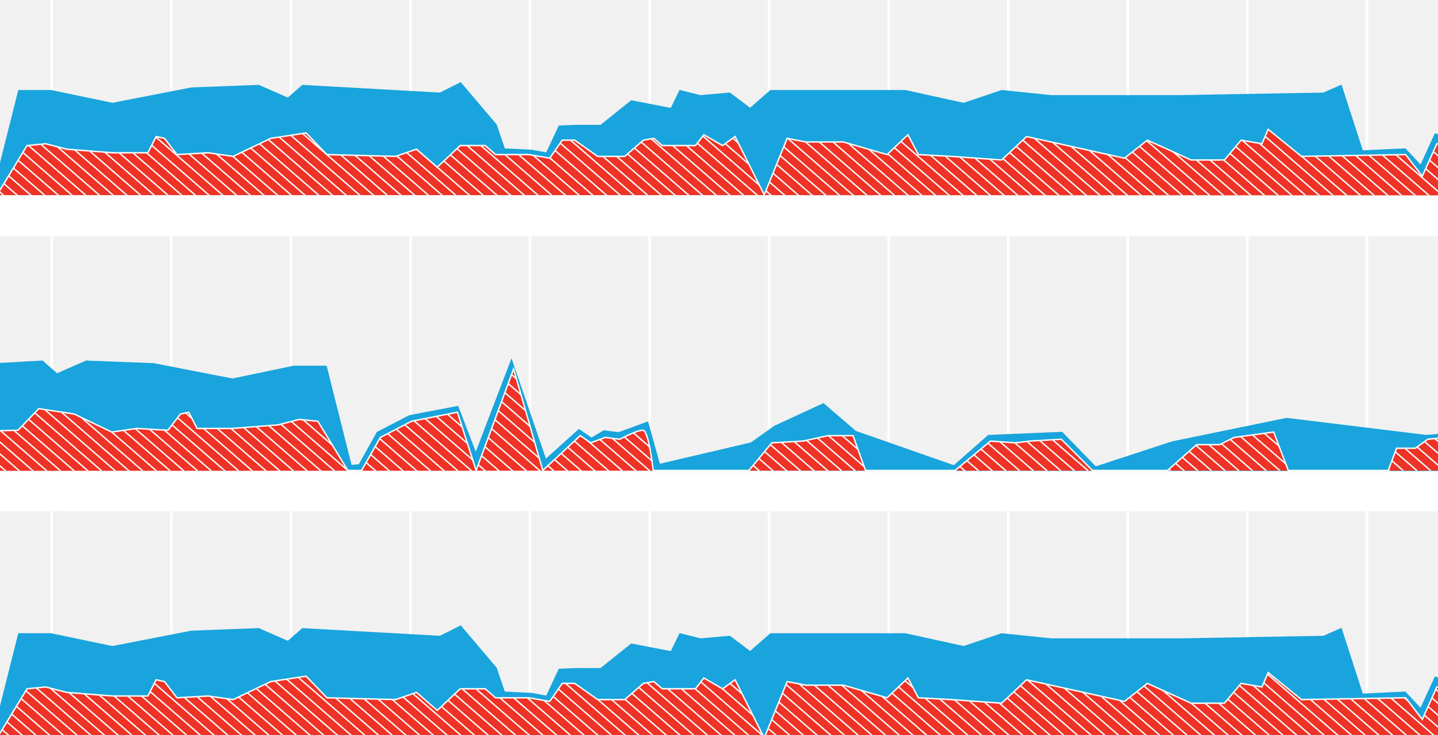
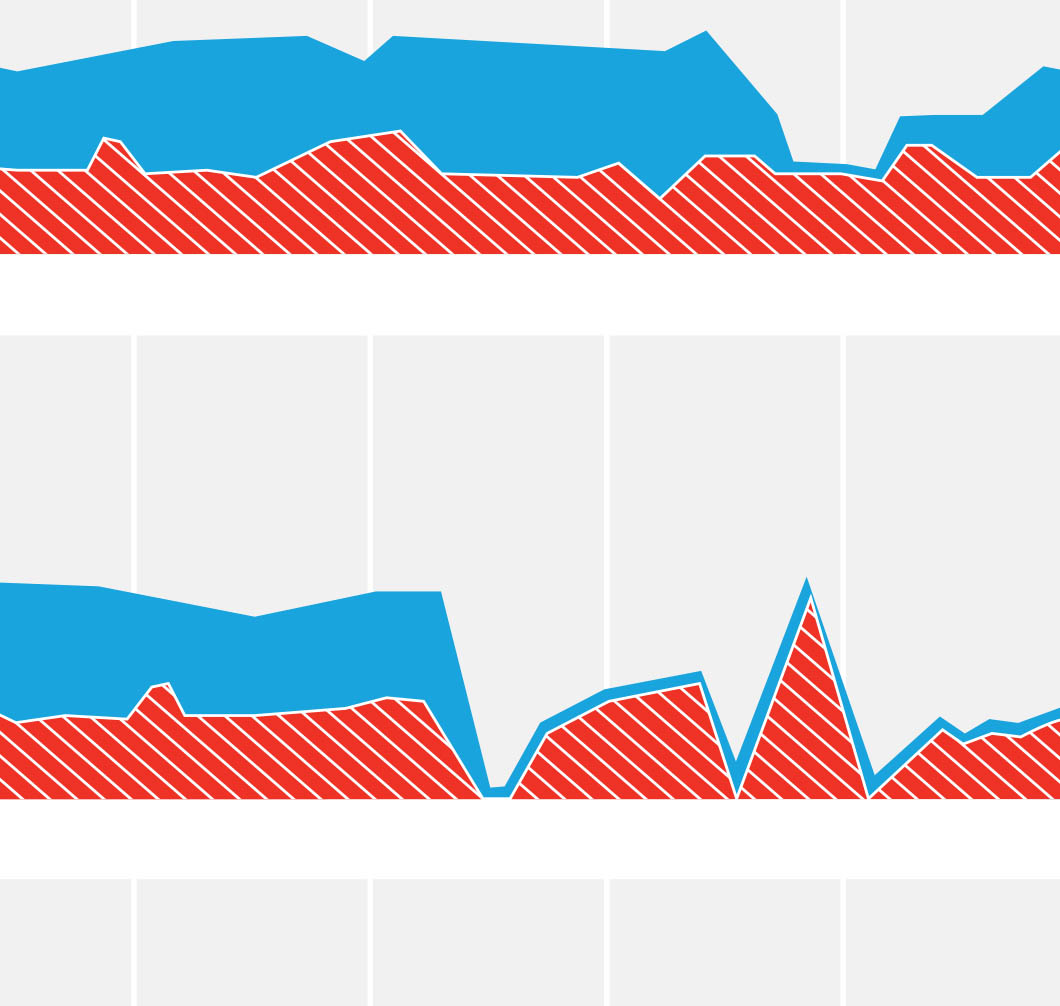
Here at Fathom we hit the ground running in 2011. We wrapped up a touch screen installation for the 2011 Consumer Electronics Show in January, helping our friends at GE shine the spotlight on all of their Ecomagination initiatives. The GE booth — a small city block is the more apt description — was an eco playground of residential wind turbines, electric cars, Wattstations, and energy efficient appliances.
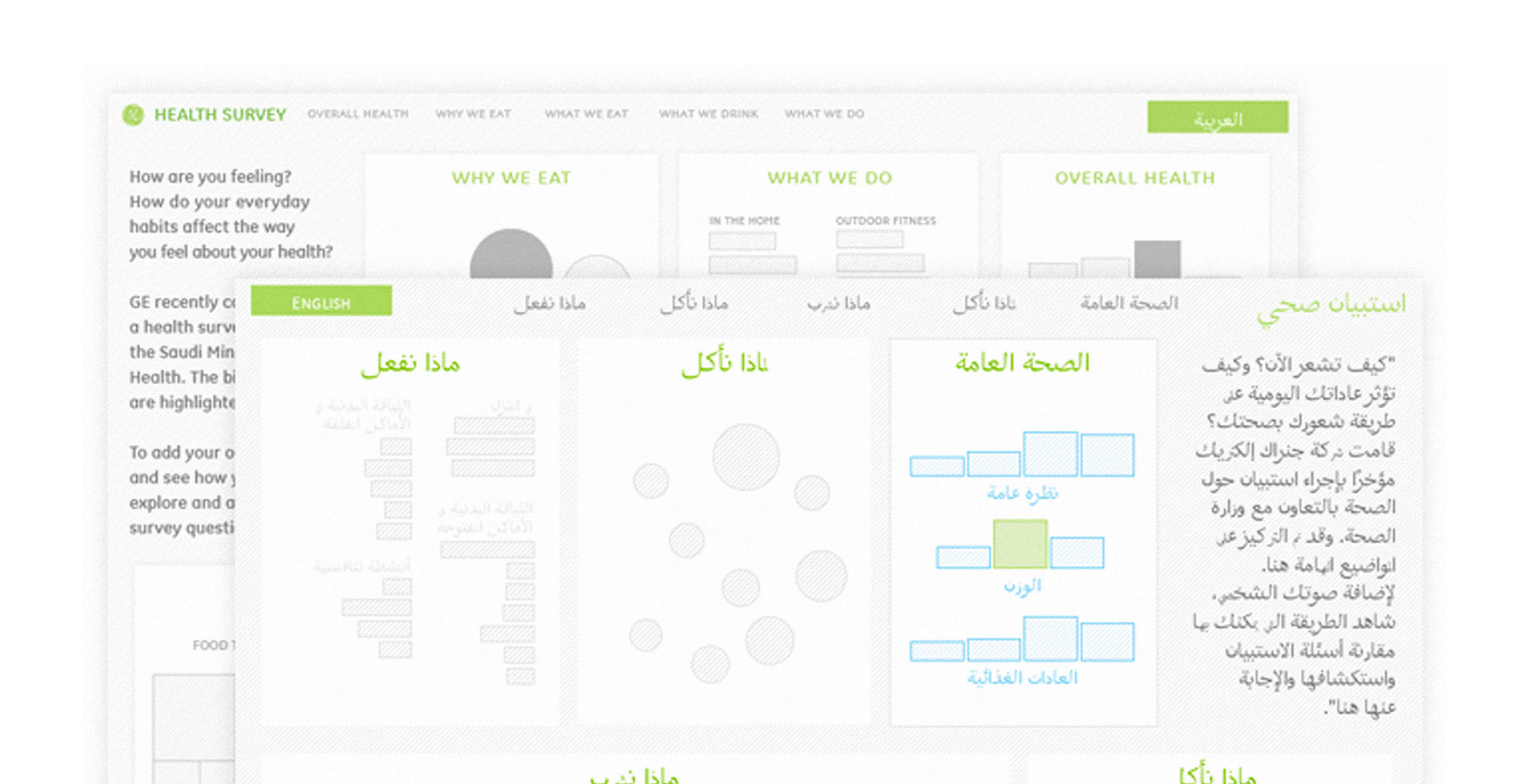

In the fall of 2010, GE partnered with the Saudi Arabian Ministry of Health to conduct a sweeping survey of health perceptions within the Saudi population, as well as trends in eating, beverage consumption, and fitness habits among Saudi consumers. We developed an online tool that not only presented the results of this study, but continues collecting survey responses from visitors to the GE Middle East Healthymagination site.
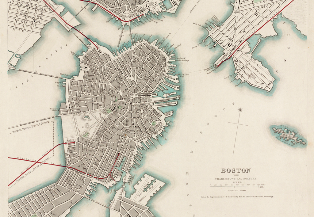
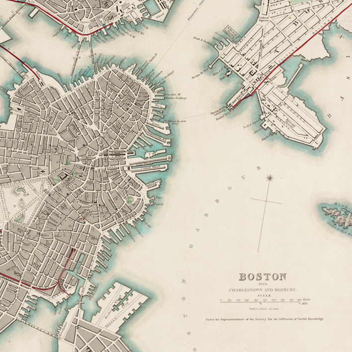
Fathom moved into new offices in September, from temporary space in Cambridge across the river to a beautifully restored cigar factory on Cambridge Street in Boston. The large copper sign on the front declares it to be the PUFFER'S BUILDING, and it sits at the edge of Beacon Hill, one of Boston's oldest neighborhoods.