Notebook
Here's where we post periodic updates on what we've been up to at Fathom. Reflections on the interesting stories that emerge from our client work, side projects, after-hours rabbitholes, and other miscellaneous threads of inquiry.
You can also follow these posts as a feed in your feed reader.
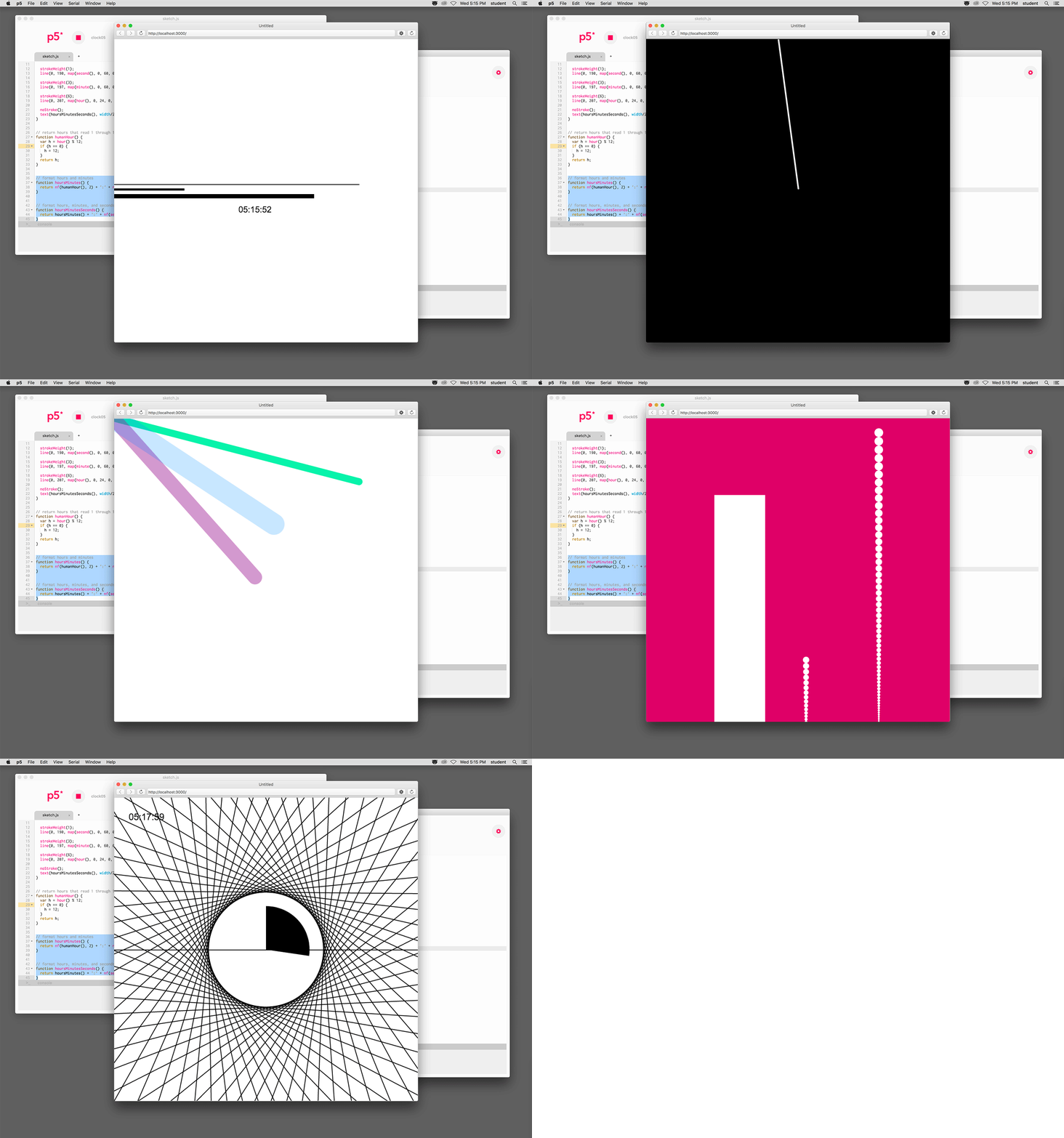
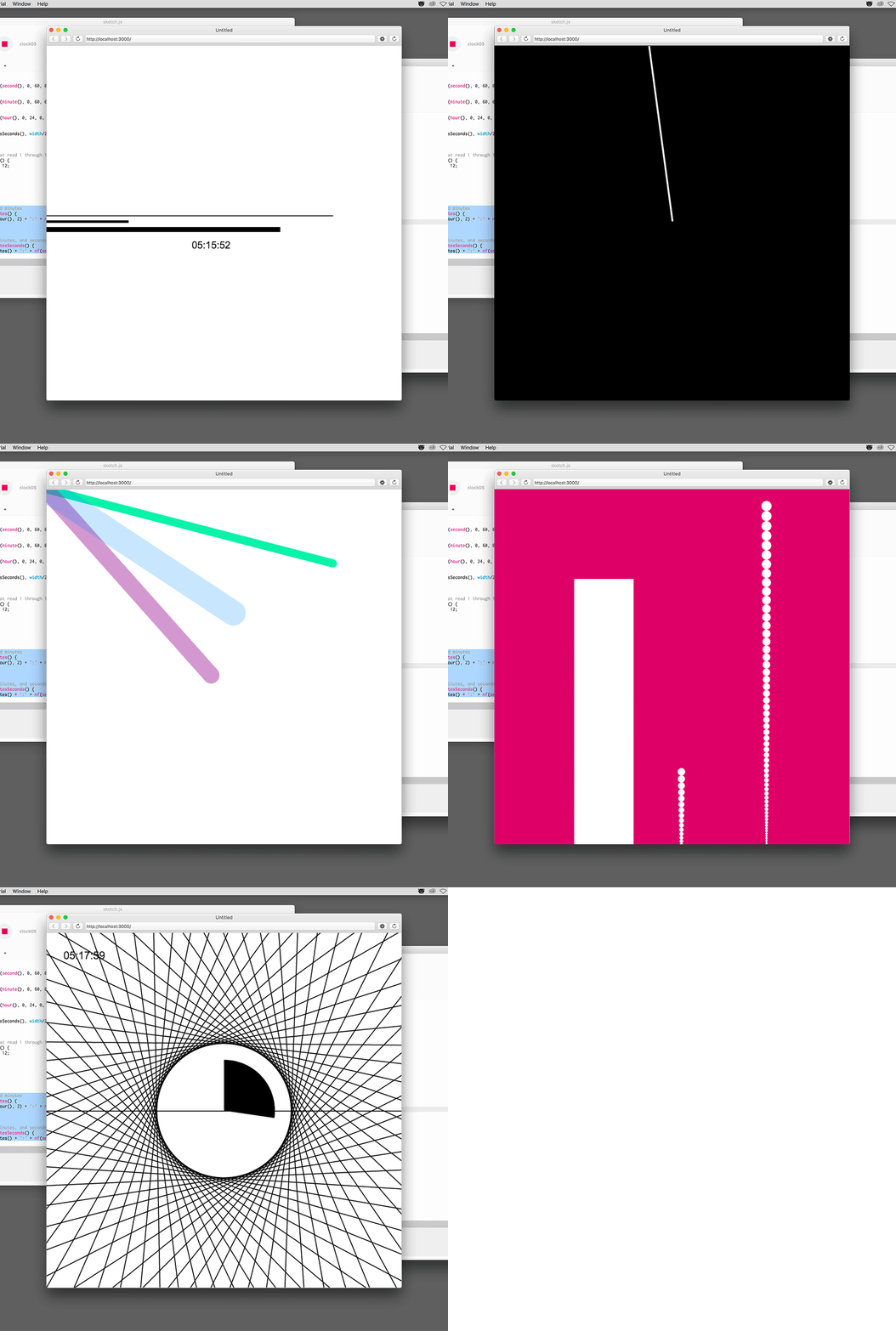
James and I recently returned from a whirlwind road trip to SUNY New Paltz, to present at their inaugural Design Week. It was an exciting opportunity to share Fathom’s work with the wonderful students and faculty at New Paltz, and to conduct an introductory workshop on coding and information design.
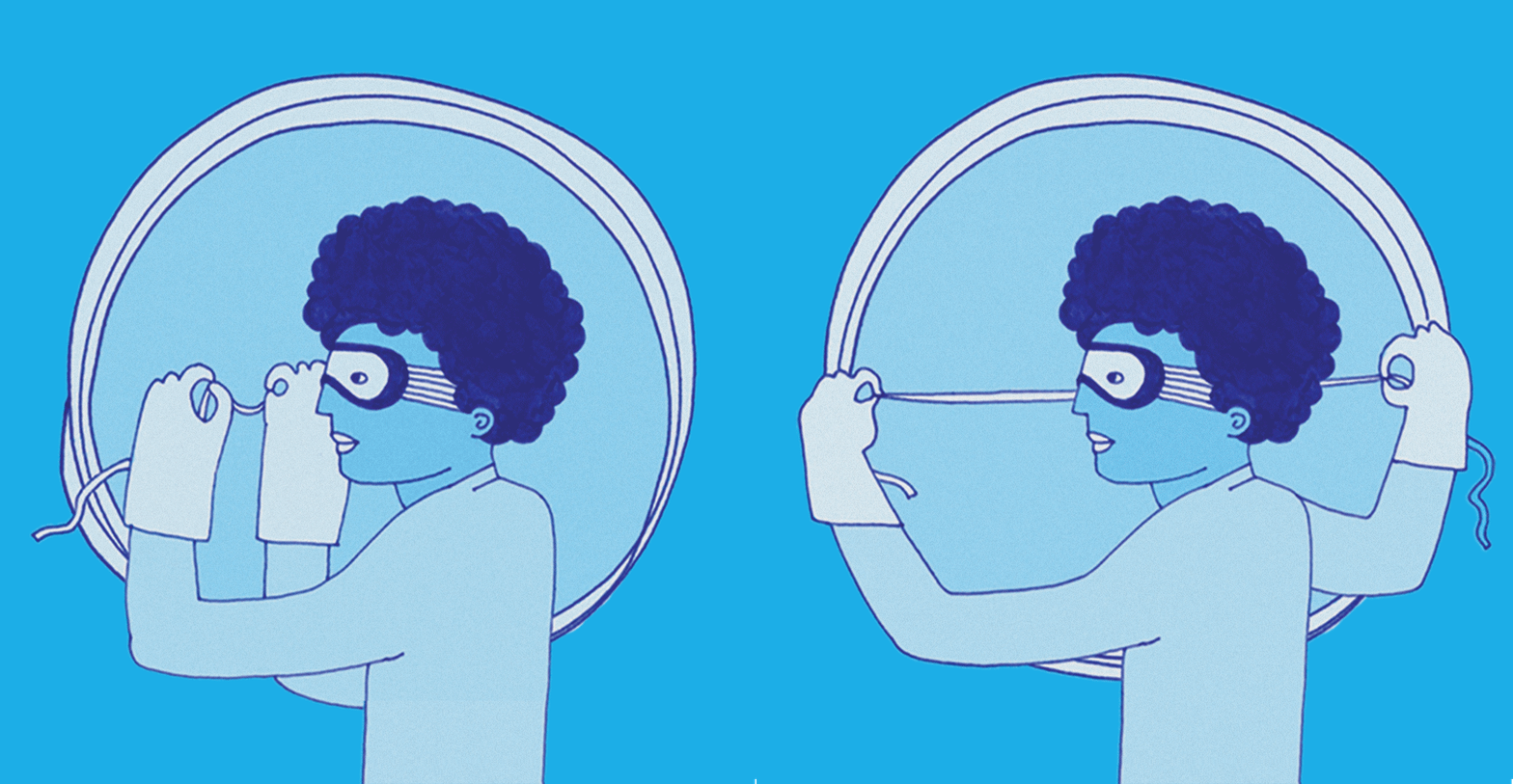
We're excited to announce the release of the second episode of Especially Big Data, our new podcast. The episode, Oh, the places we go, explores the great lengths people travel to collect a single data point, and the many issues they encounter along the way. From the door-to-door surveys of the U.S. Census, to the mountain treks of community health workers, and then to NASA satellites hovering 650 km above the earth, tune in to hear some exciting tales from the trails.
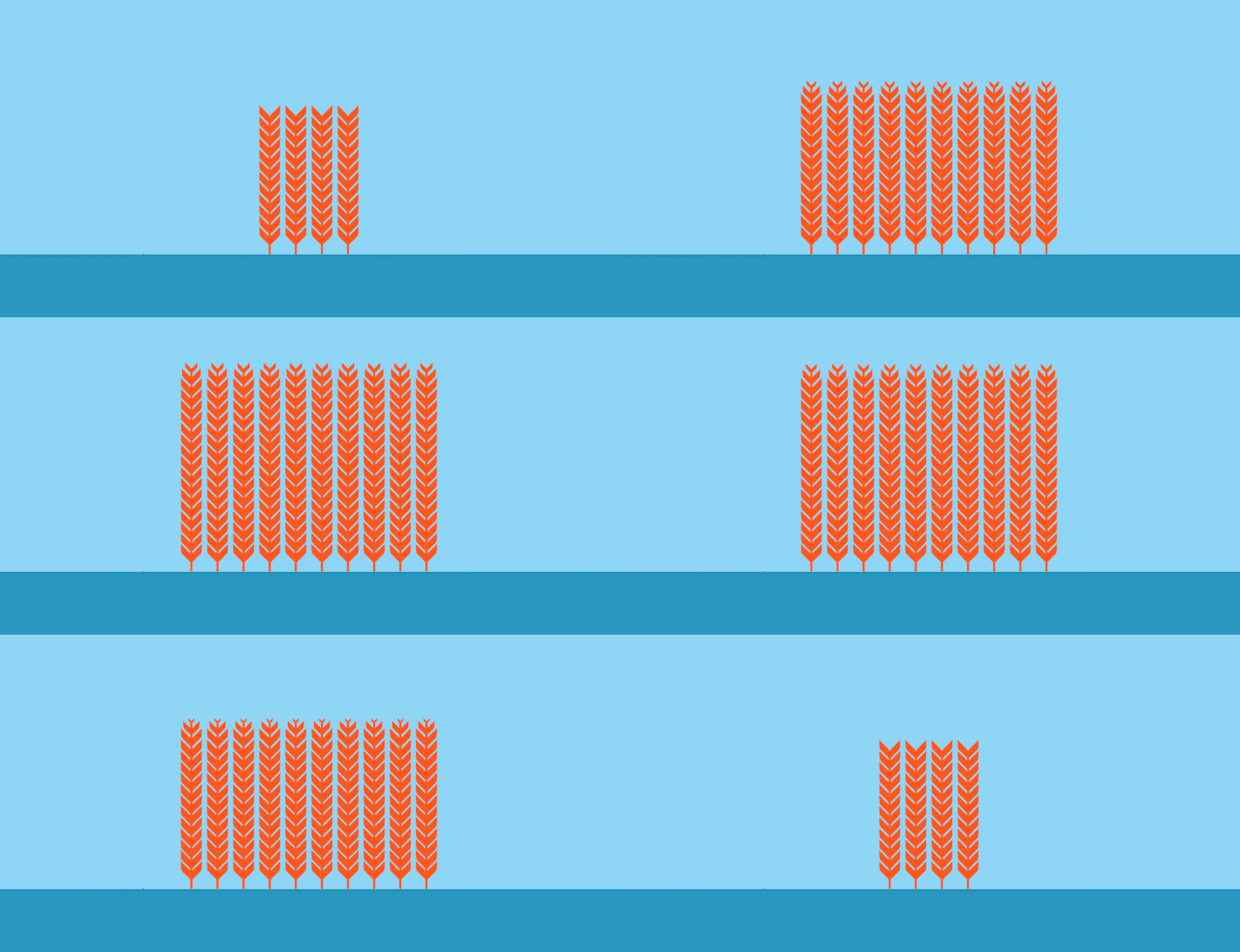
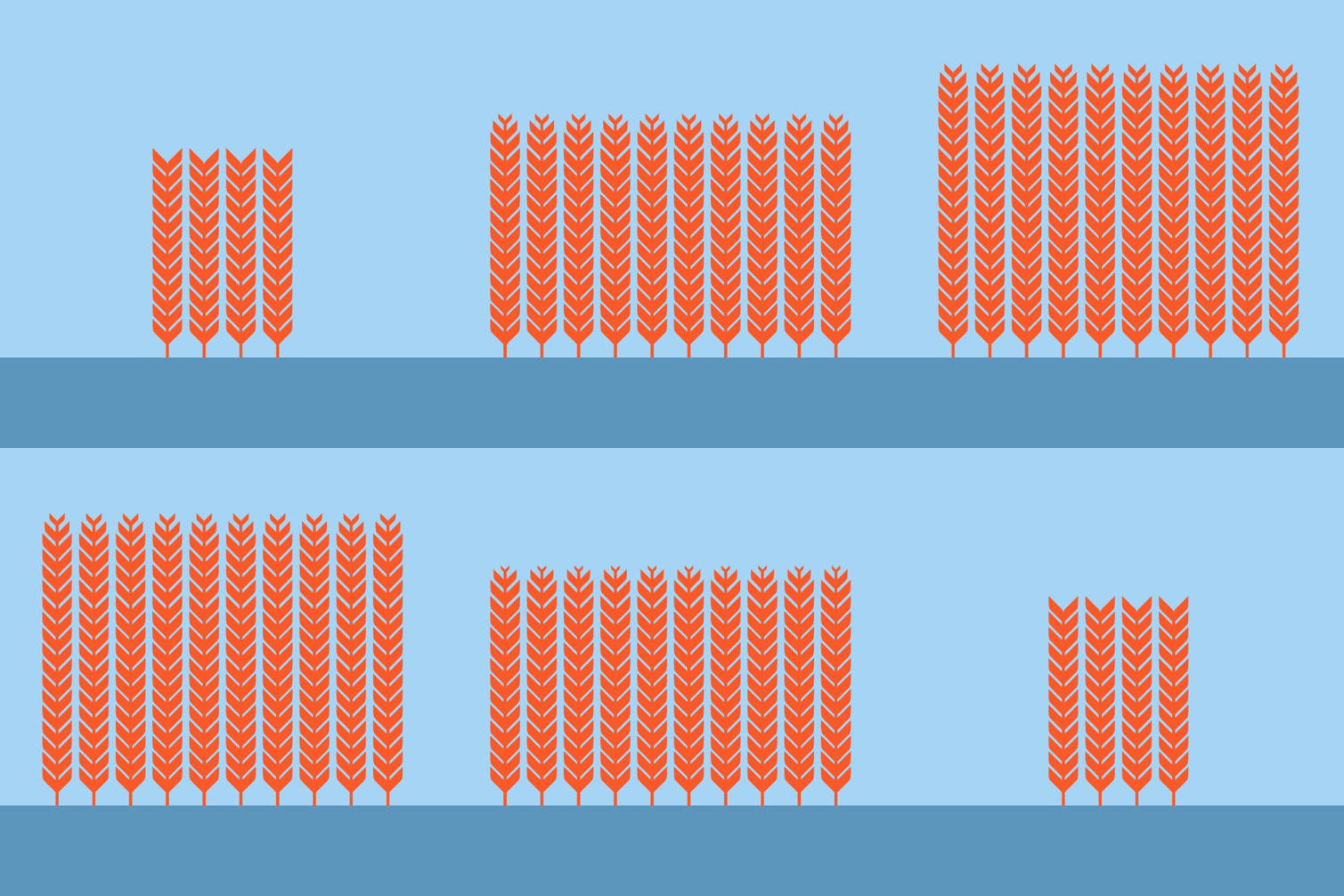
To celebrate International Women's Day, we created a video for No Ceilings that demonstrates how achieving gender parity is critical to accomplishing the seventeen sustainable development goals (SDGs). In 2015, 193 countries around the world created a global agenda—outlined by the SDGs—intended to reduce poverty, increase shared prosperity, and protect the planet, among a series of other objectives. No Ceilings is a data-driven platform we built in collaboration with the Clinton Foundation and the Gates Foundation to measure the progress and setbacks of girls and women worldwide. Given the similar objectives of the SDGs and No Ceilings, we were both humbled and excited to create the video.
We're pleased to announce the launch of our new podcast: Especially Big Data. While it deals with data both big and small, the podcast explores the many subjects data can document-- which can include everything from what you ate for breakfast this morning to the variability of global ocean currents. In other words, people collect data to track almost everything these days; and we're here to tell you everything it can explain, while also shedding light on everything it leaves out.
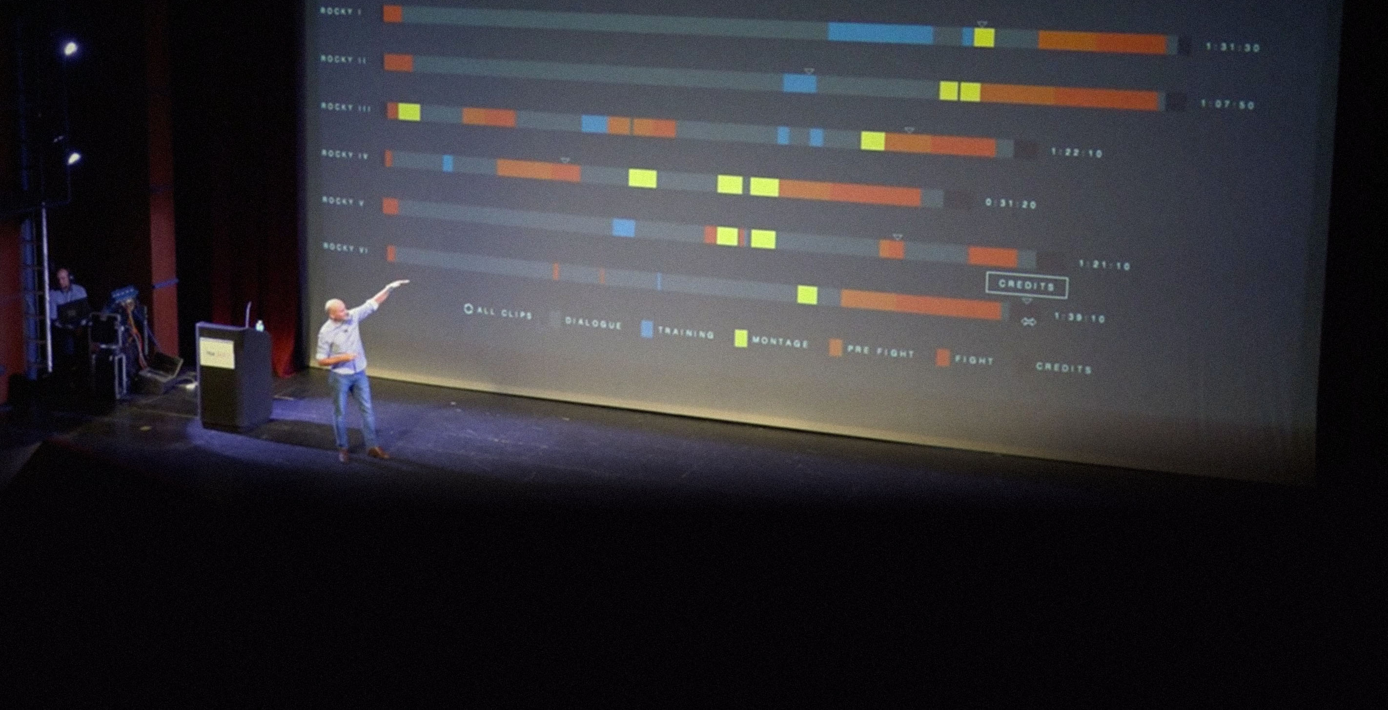
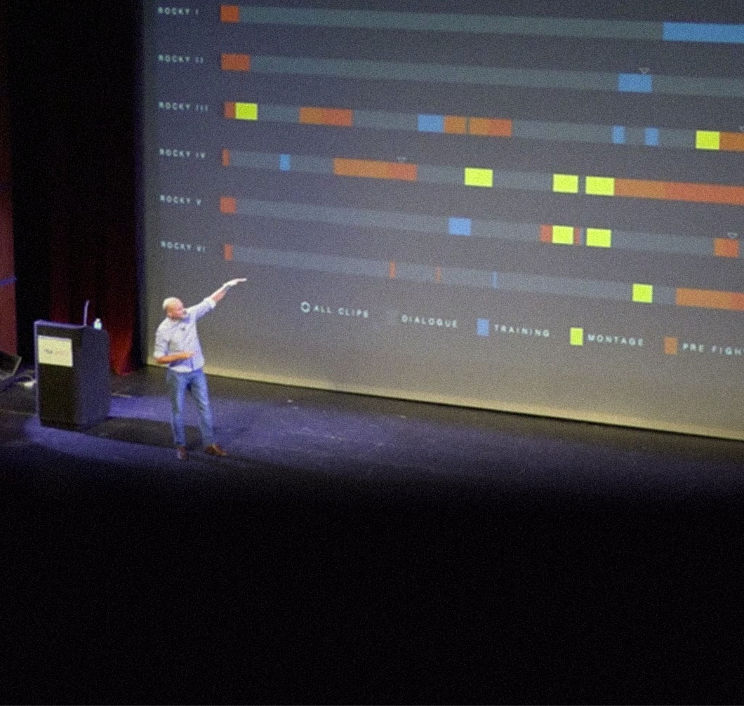
This past fall I spoke at the Themed Entertainment Association (TEA) SATE conference at Carnegie Mellon University. SATE stands for Storytelling, Architecture, Technology and Experience — the core elements of themed entertainment — and by "themed entertainment" they mean amusement parks like Disney World and Universal Studios, among others.
We're excited to announce our latest project, an interactive timeline for GE's corporate website showcasing their transformation as a company over the last 100+ years. GE is one of the world's largest companies, and that only feels more true as you look through their history, and see how they have influenced almost every sector of technology and industry. From healthcare to aviation, energy and power to television, GE has touched it all.
We’re happy to report that for another year, our curiosity and love of print have enabled us to give back to our local community and beyond. Our latest printed project—The Preservation of Favoured Traces—continues the tradition. Proceeds from all our books, offset posters and on demand posters are donated to organizations that support areas we are interested in. From supporting female entrepreneurs to encouraging more active and sustainable transportation, the diverse interests of folks in the office are reflected by our areas of donation.
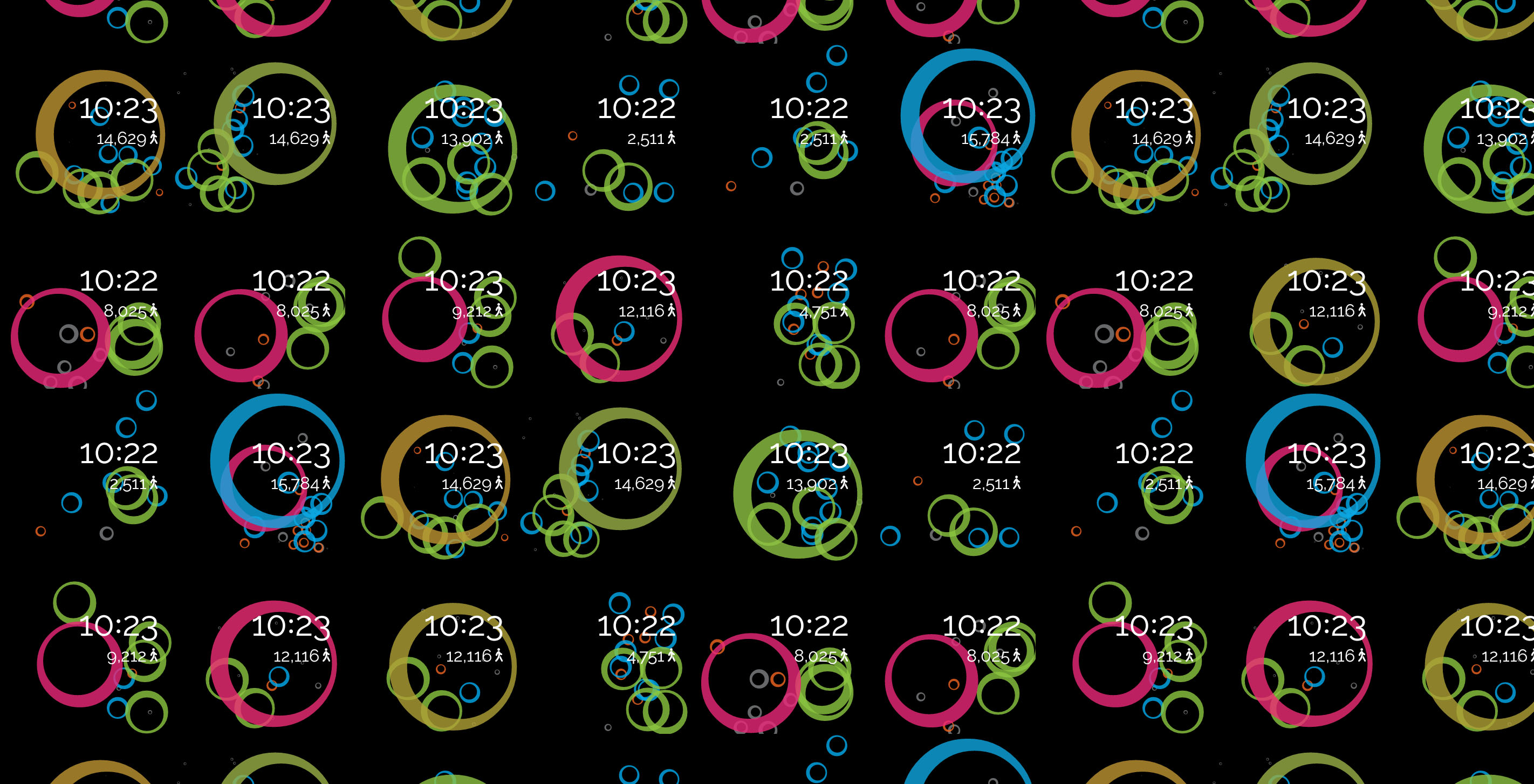
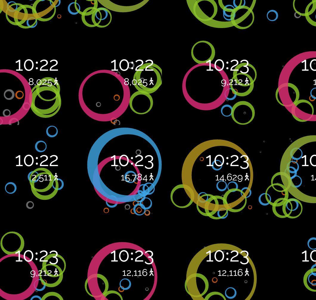
The Android Experiements are composed of a gallery of creative open source projects developed for the Android platform, and were introduced as a way to “encourage more developers to challenge how we interact with the devices we use every day.” In the spirit of the experiments, we set out to challenge how users interact with their Android Wear devices, and in doing so challenged none more than ourselves.
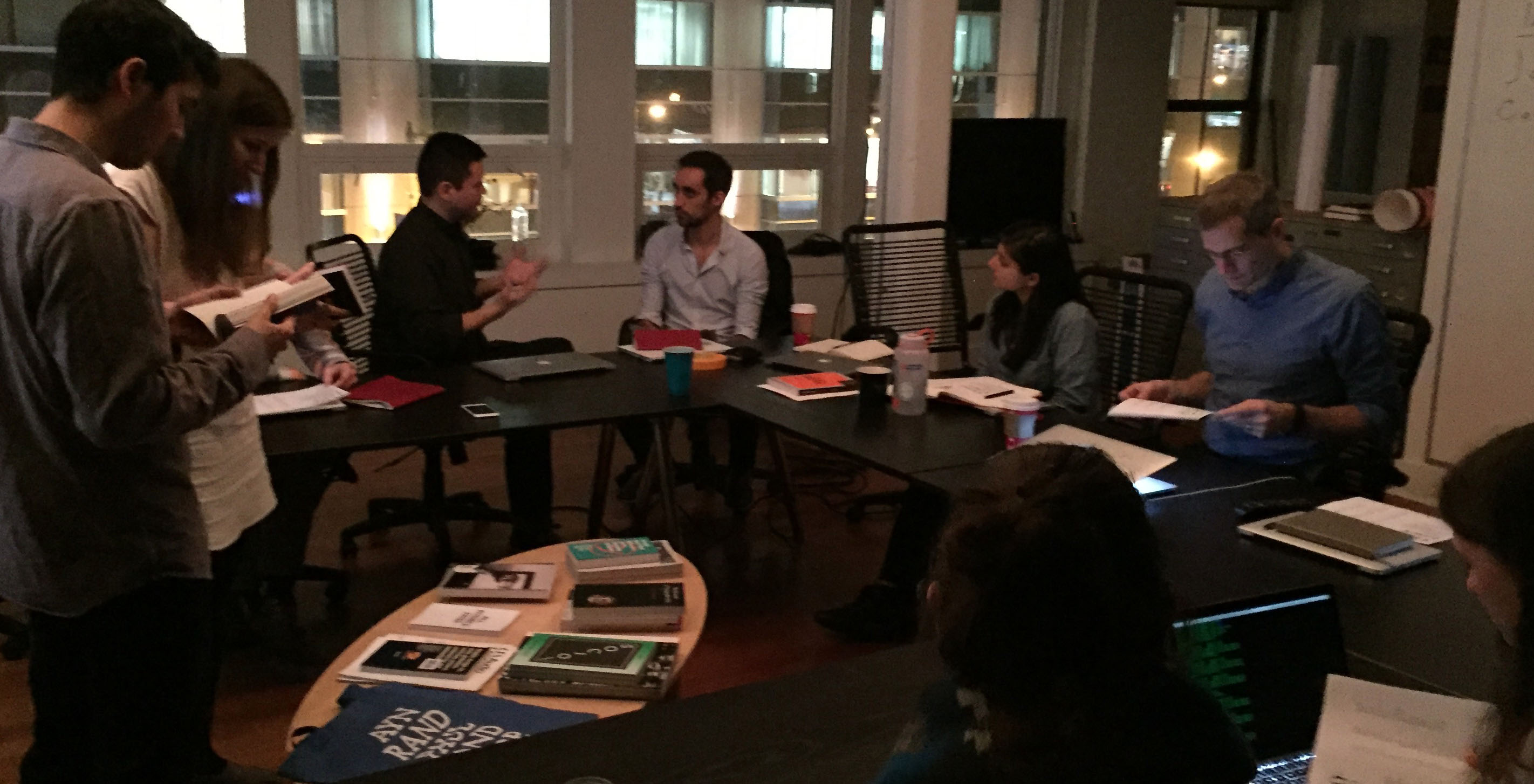
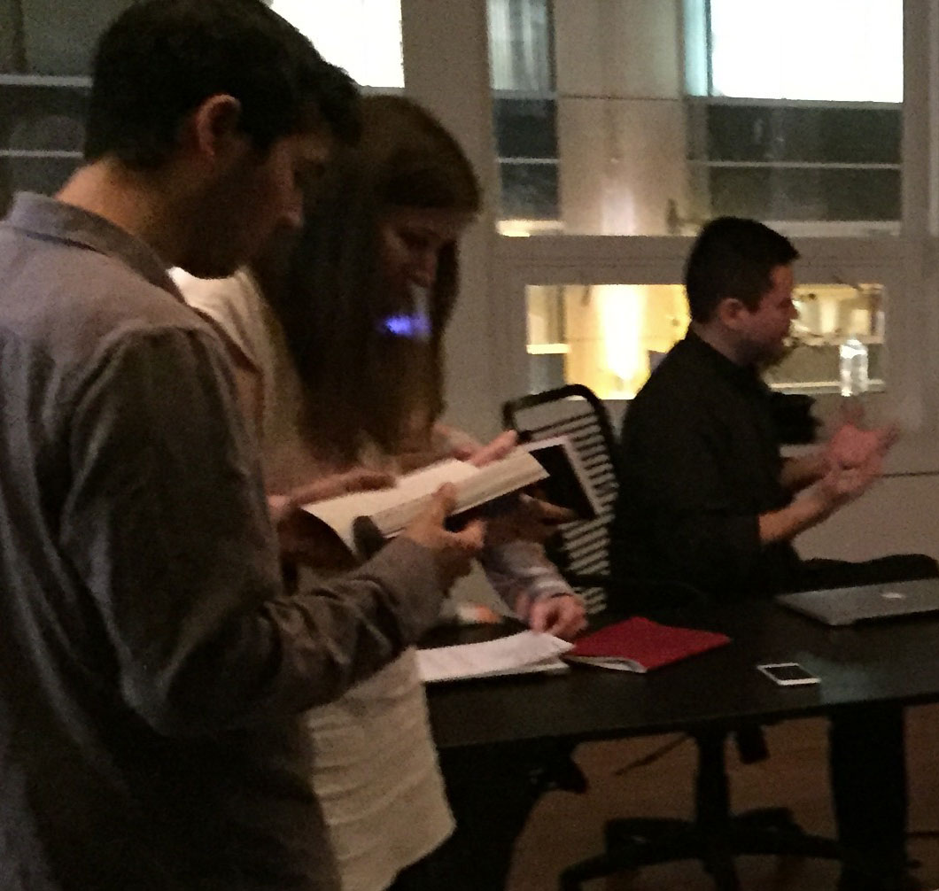
Fathom’s recent Architecture of Typography workshop was a fun opportunity to hone our design skills and discuss trending topics in type.
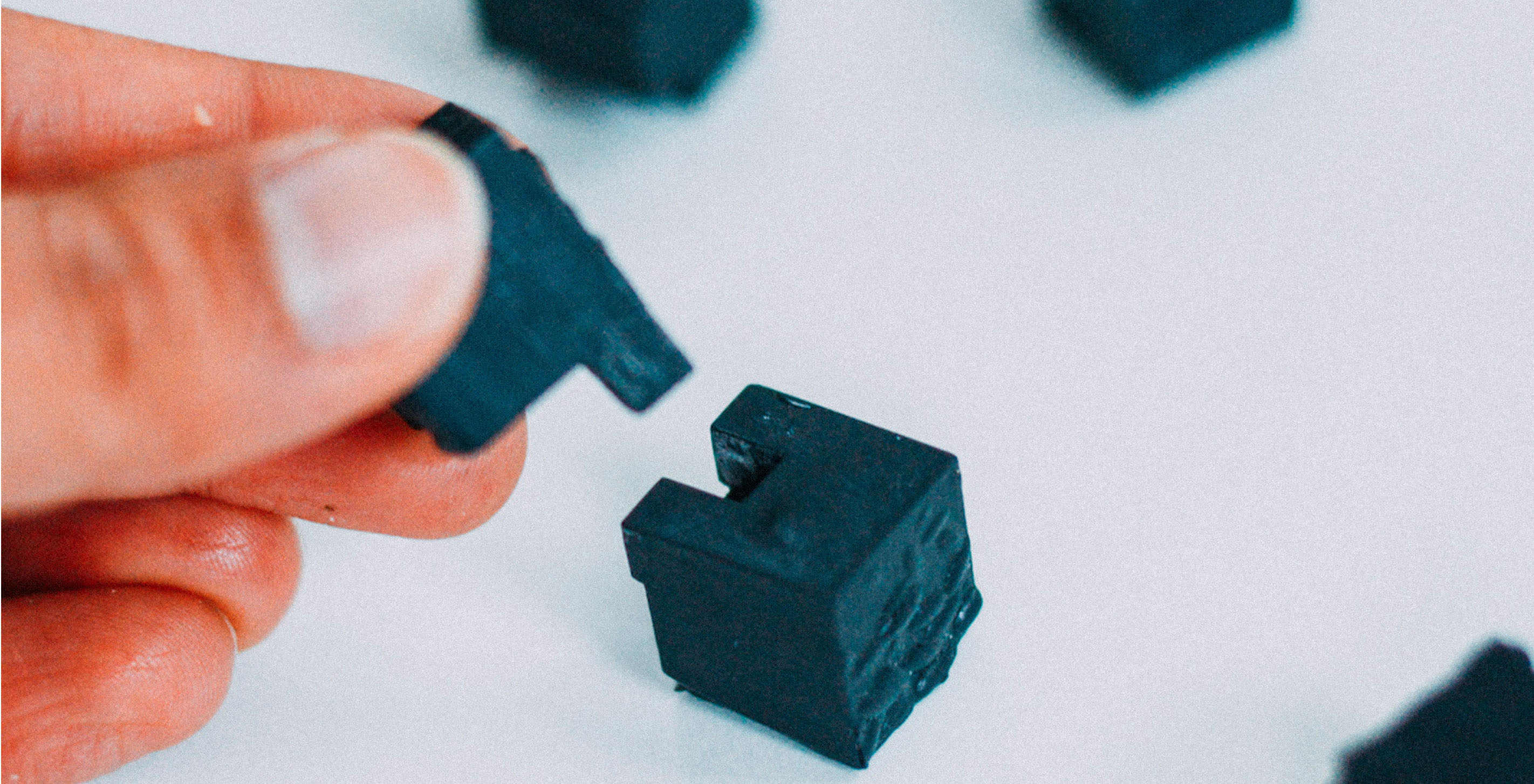
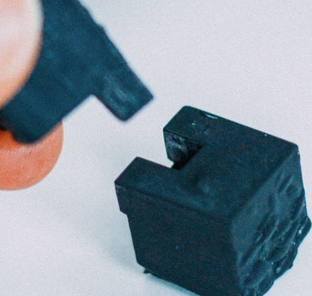
For the past few weeks, I have served as Fathom's in-residence explorer of 3D printed information design with Formlabs’ Form1+ printer. Because my goal was to focus on the physical medium and form, I tried to stay away from directly 3D-ifying data visualizations that already exist in 2D (think extruded line graphs, bar graphs, etc.), or from arbitrarily mapping data points onto 3D space for the sake of aesthetics. Instead, I zeroed in on the features of physical objects that cannot be expressed on a screen, breaking them into two categories: material and interaction. More on forks later.