Notebook
Here's where we post periodic updates on what we've been up to at Fathom. Reflections on the interesting stories that emerge from our client work, side projects, after-hours rabbitholes, and other miscellaneous threads of inquiry.
You can also follow these posts as a feed in your feed reader.
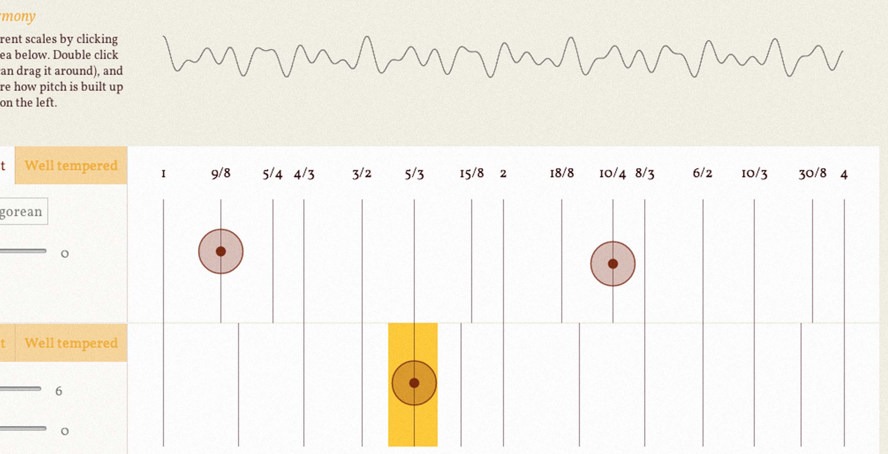
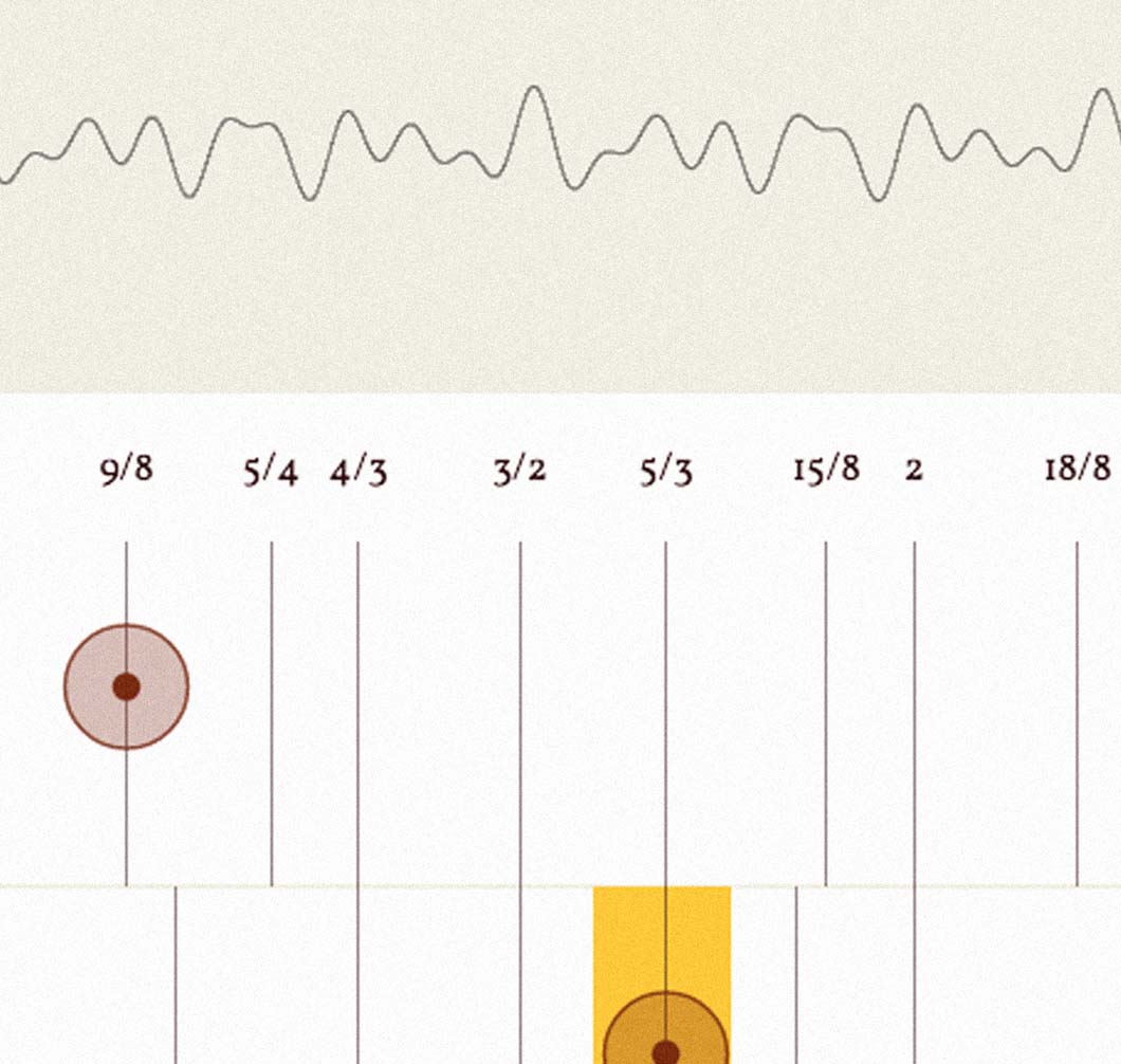
I had some early experience with the problems of a well-tempered scale. Within a few months of learning guitar, it seemed some chords just didn't sound good unless the guitar was tuned especially for them. This got me interested in the way harmonies and scales are constructed from pitches and frequencies.
Continuing our fascination with color naming across cultures, we set our summer intern, Malika Khurana, on a journey to discover new colors. Color naming, no matter your language, is a verbal process. So one of the driving interests was to see how this could be integrated into a mobile app using speech recognition. In this post, Malika retells her adventure.
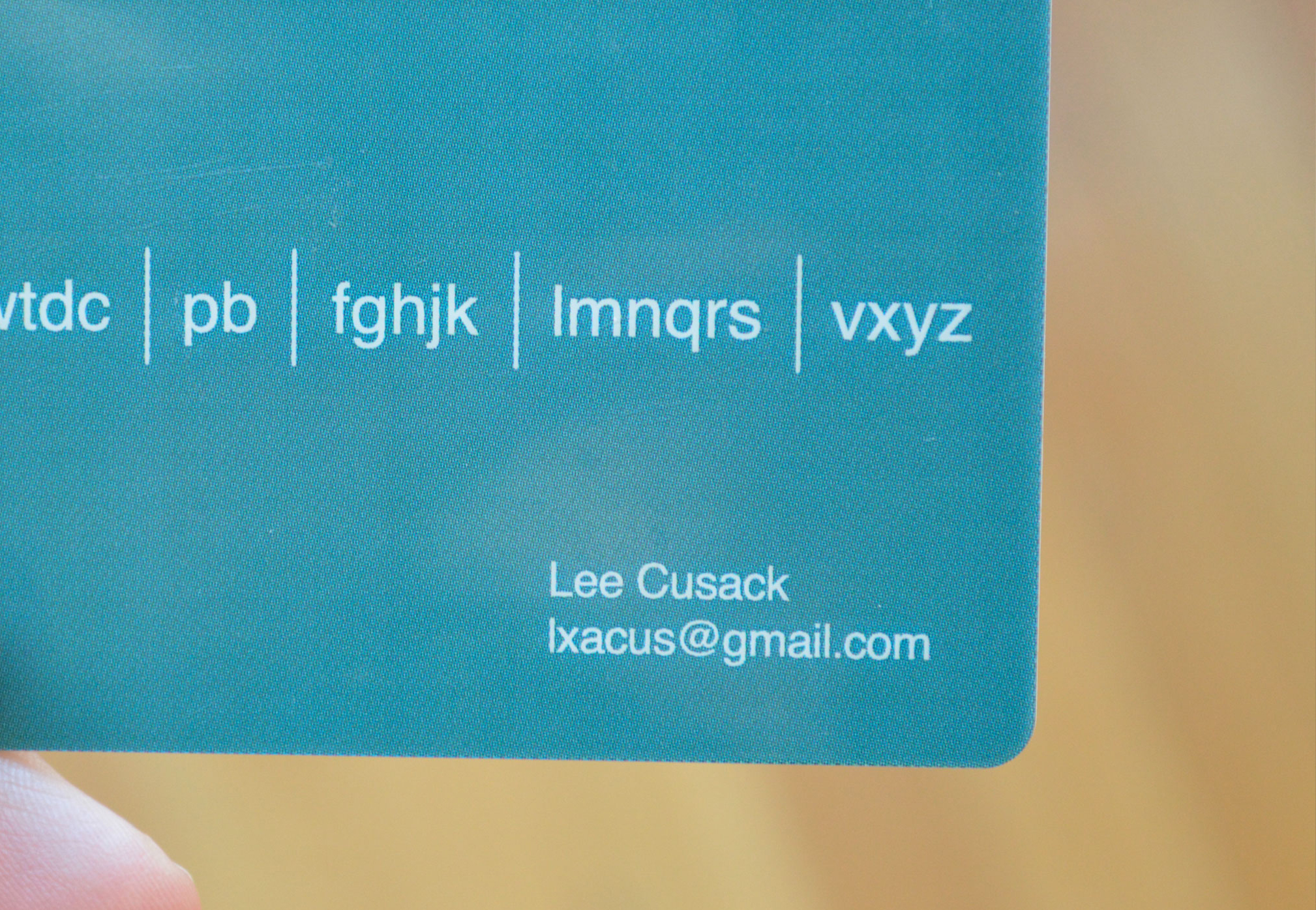
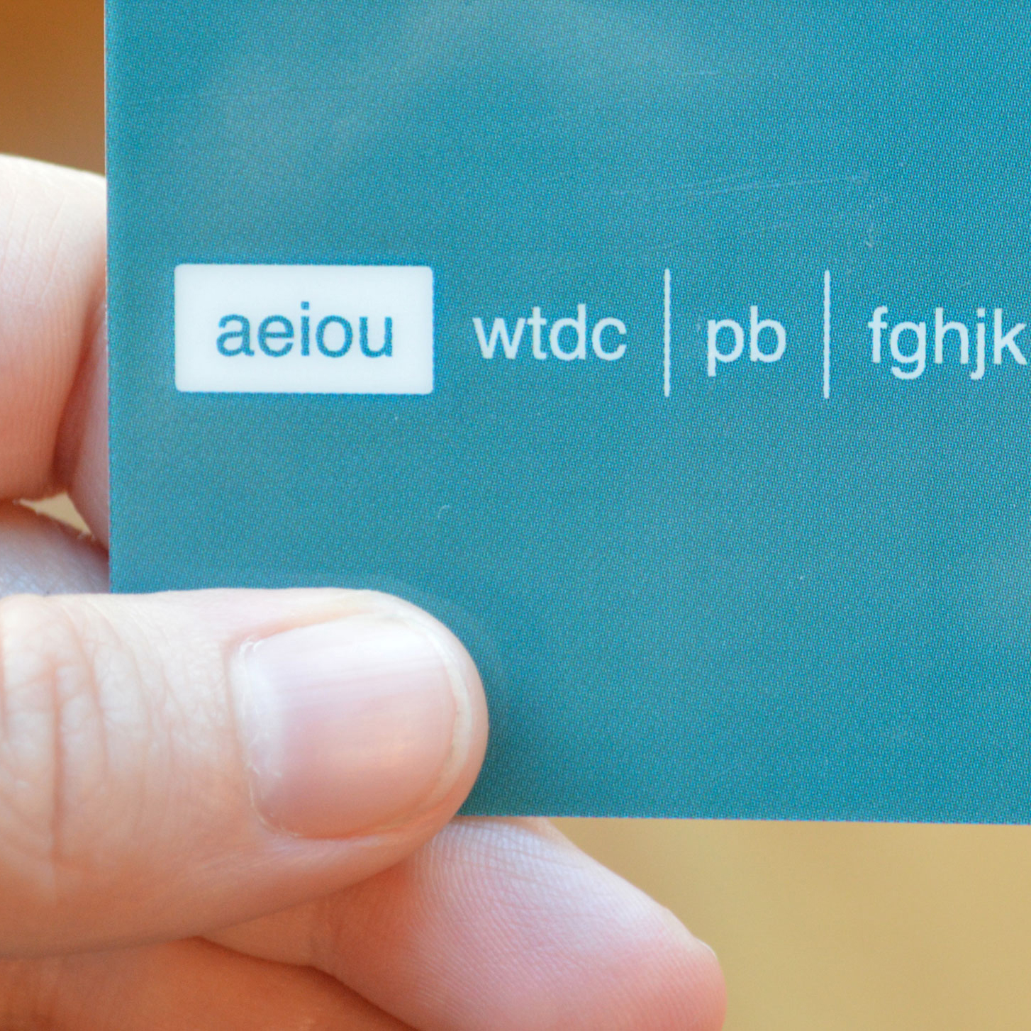
This is a post by Lee Cusack, our summer intern and recent graduate of Lesley University’s College of Art and Design. We’ve had an awesome time working on a project with him that sheds light on making face-to-face *conversation* universally accessible. (Photo captions by Terrence)
This year we held a mini-conference in Portland, Maine with local friends and neighbors Sosolimited and Design I/O for an opportunity to review projects, exchange ideas, and share working methods.
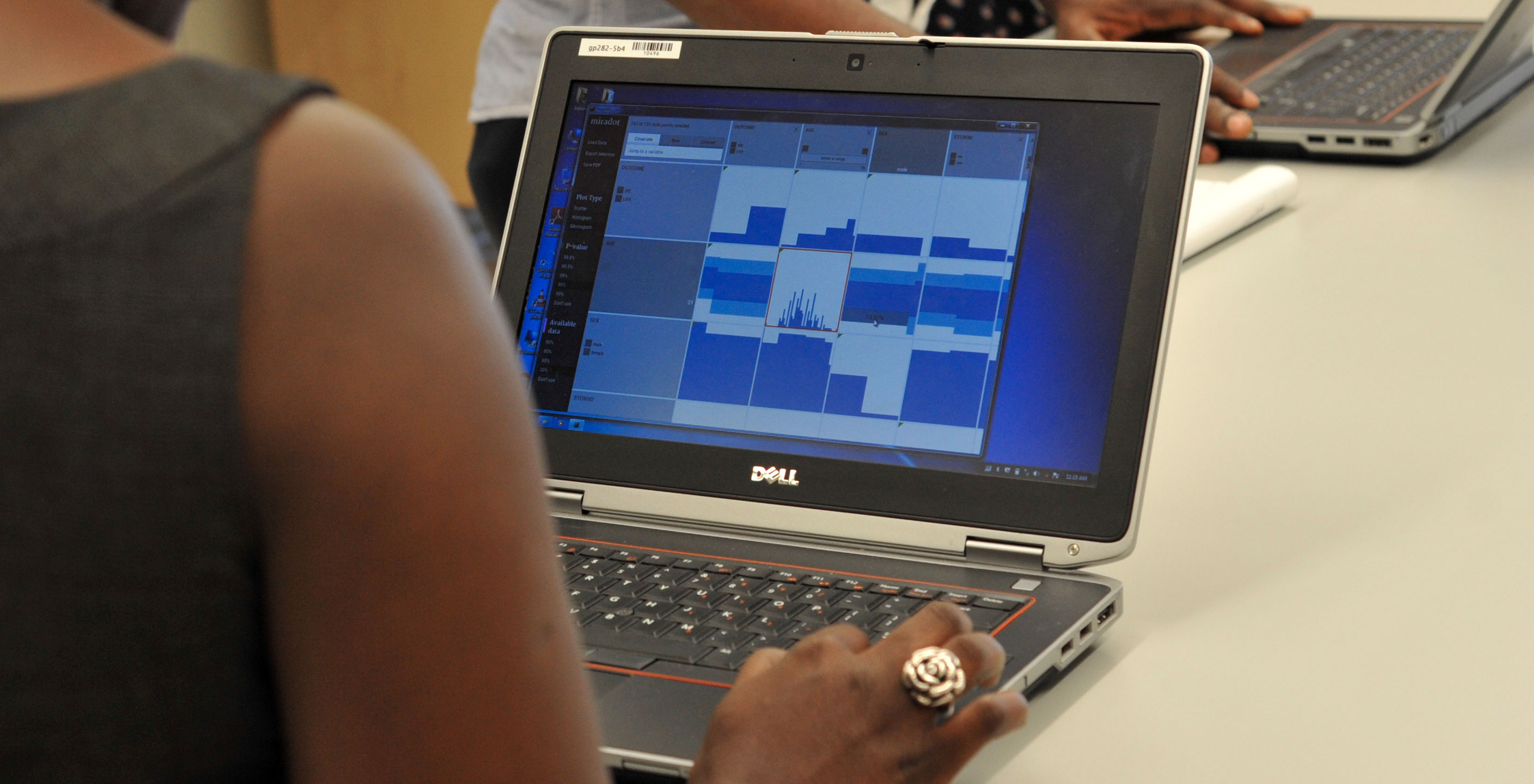
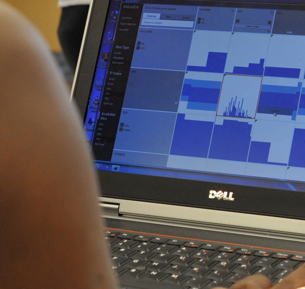
In June we released Mirador, a tool for visually exploring complex datasets, enabling users to infer new hypotheses from data and discover correlation patterns. Mirador is a collaboration between Fathom and the Sabeti Lab, which is part of the FAS Center for Systems Biology at Harvard University.
There is a core pedagogical foundation here at Fathom. Whether it be through our fascination to learn new coding languages, adapt the ones we know, or critically reflect on our design work or that of others. We also love learning from our fellow colleagues in the field, as we did recently on a creative retreat with sosolimited and design I/O — more on that soon. This summer things got a bit more formal in terms of teaching and learning, for myself, and for the studio.
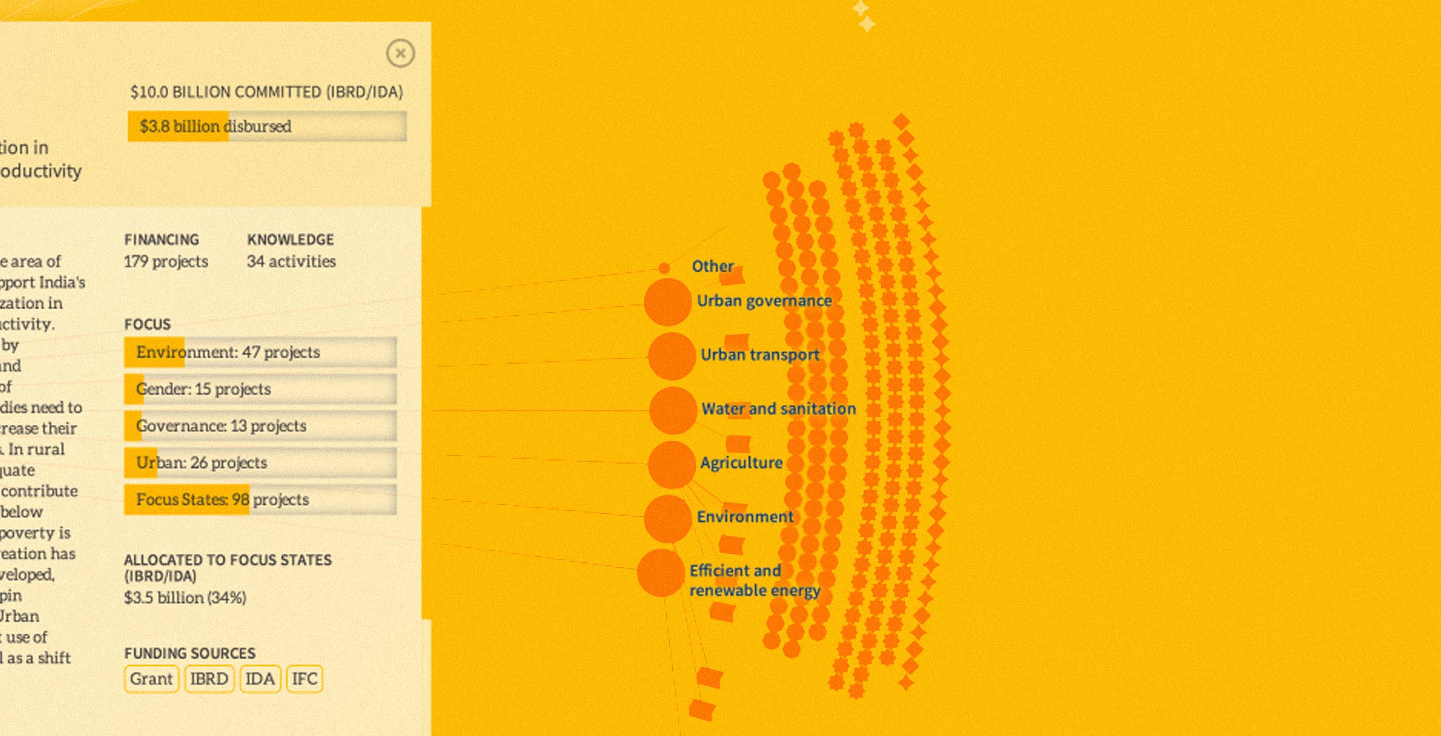
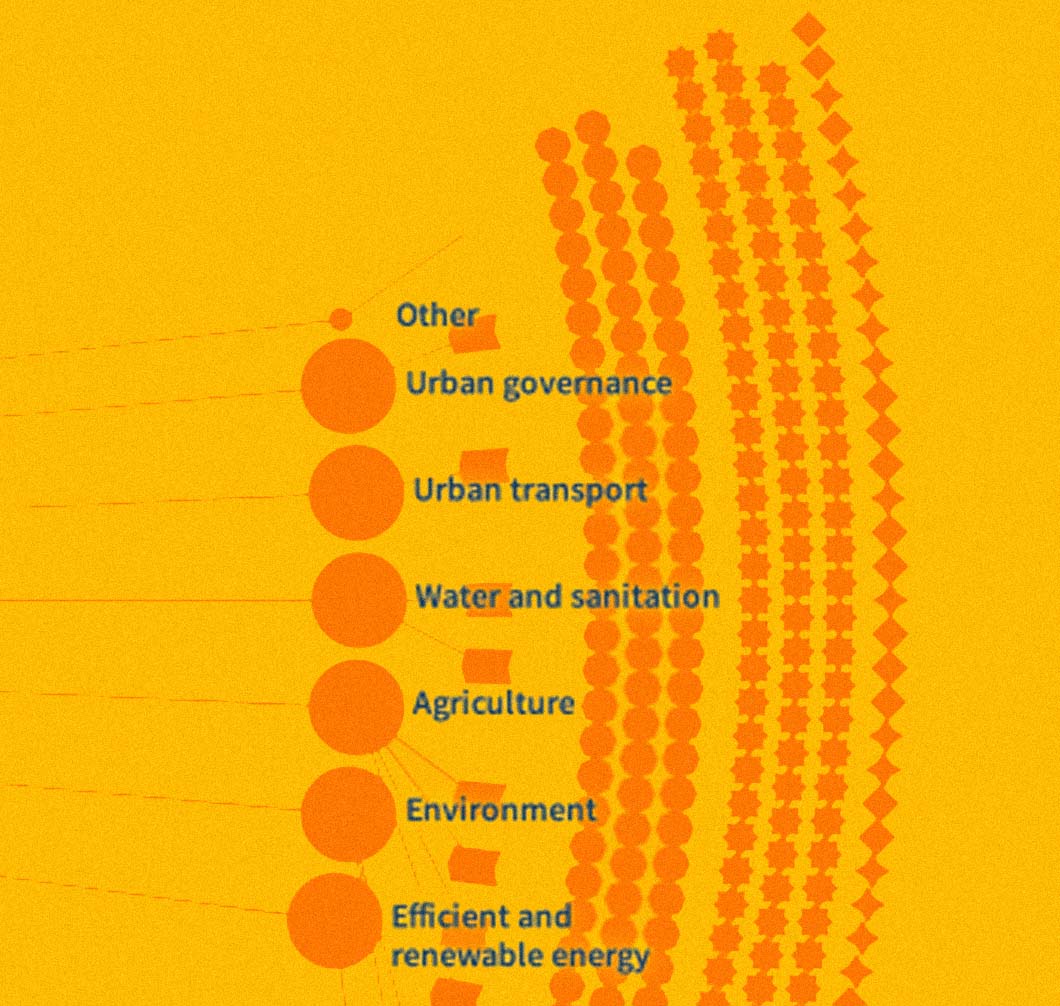
Despite unprecedented economic growth over the last fifty years, India is still home to one-third of the world's poor. Our latest project with the World Bank Group explores the Country Partnership Strategy for India (CPS) — a multi-billion dollar investment aimed at ending extreme poverty and promoting shared prosperity in one of the world's most populous countries over the next five years.
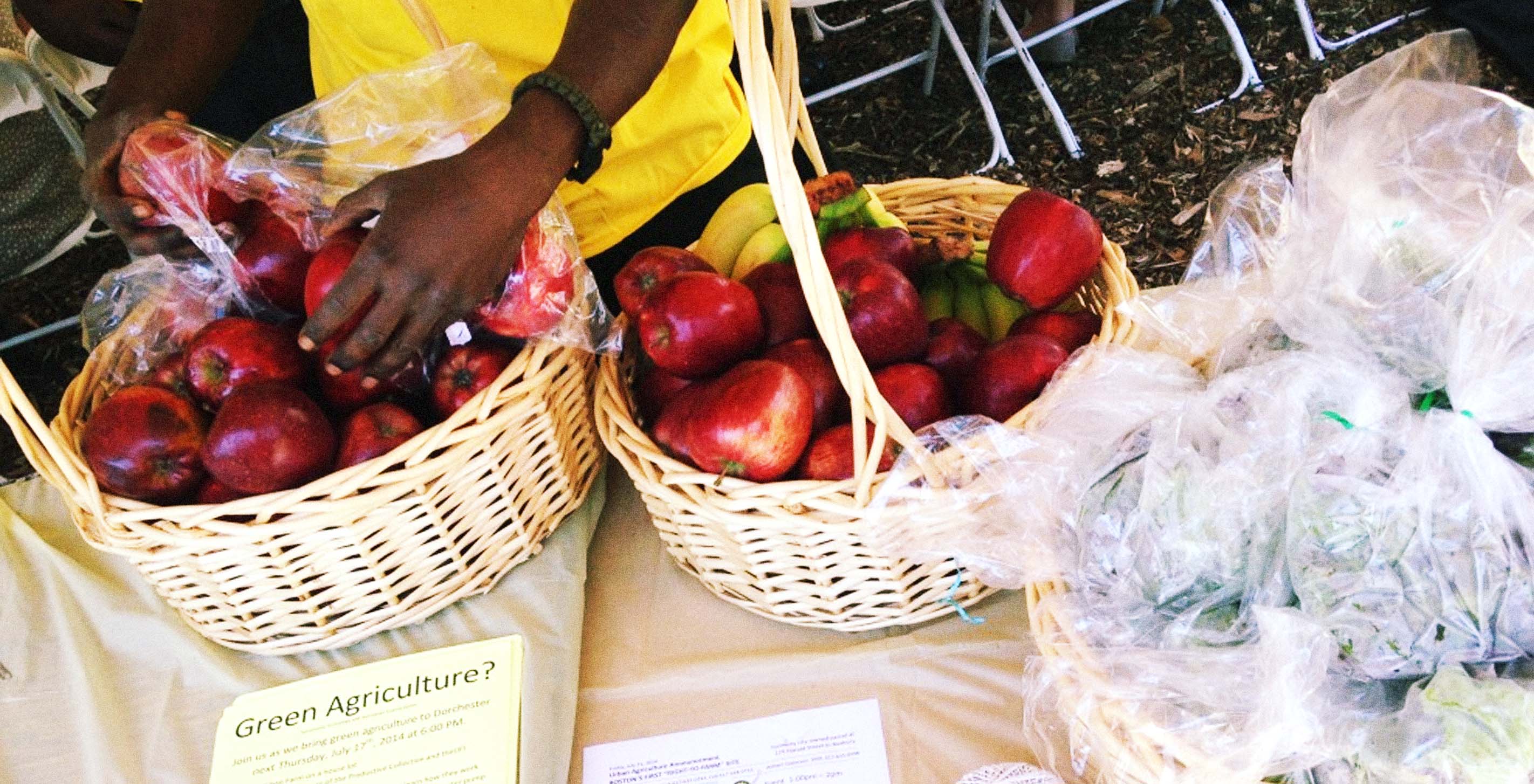
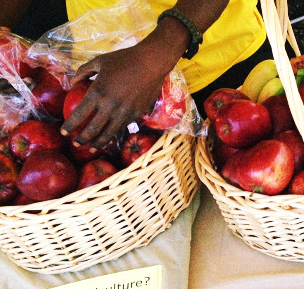
Lo and behold, on the first official Urban Agriculture Day in the City of Boston, we are excited to release our latest project, urb.ag. The tool enables users to find locations where they can pursue different urban agriculture activities around the city. By selecting a specific location, you can see which farming opportunities are available, and which actions you'll need to take to start a commercial farm in Boston.
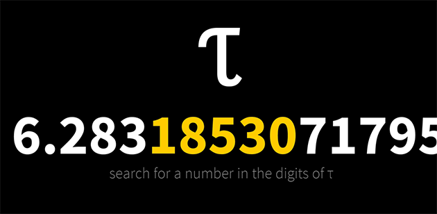
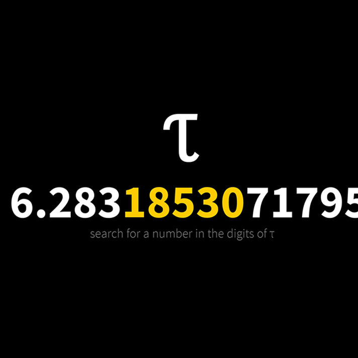
Half tau months after the initial release of Peek in Pi, we are excited to present you with Peep in Tau. It’s a new turn on our celebrated app, but instead lets you search for any number in the digits of τ.
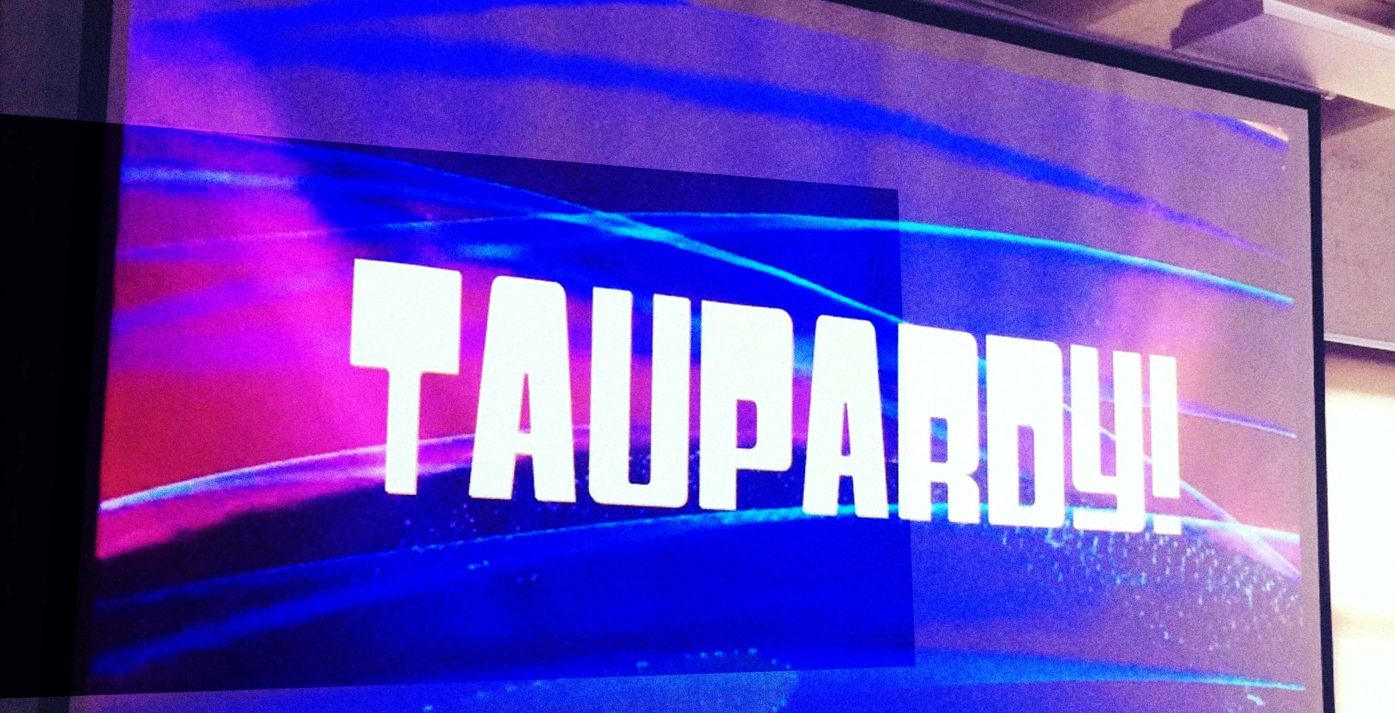
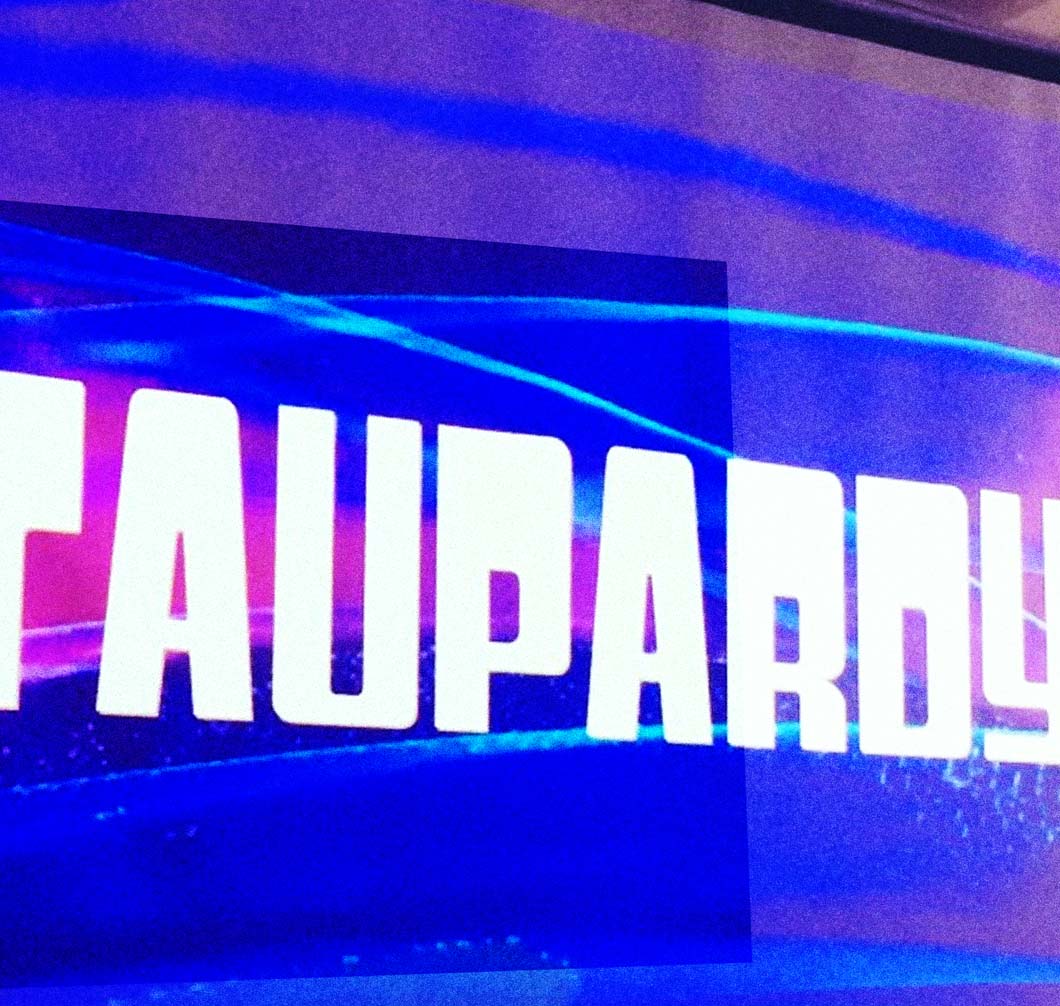
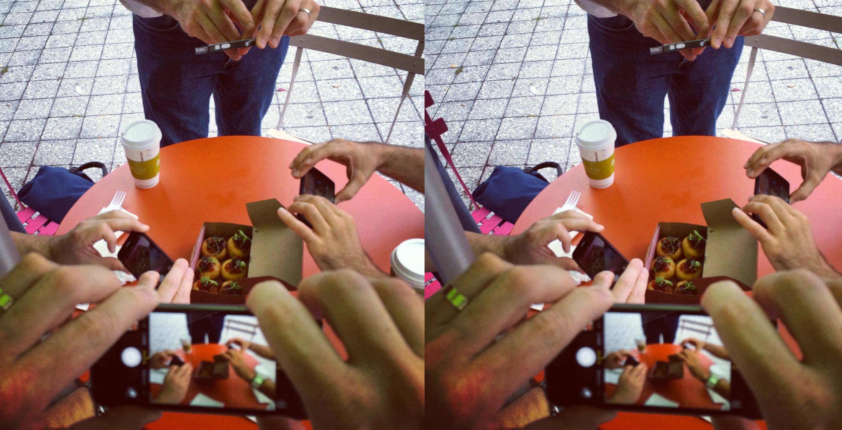
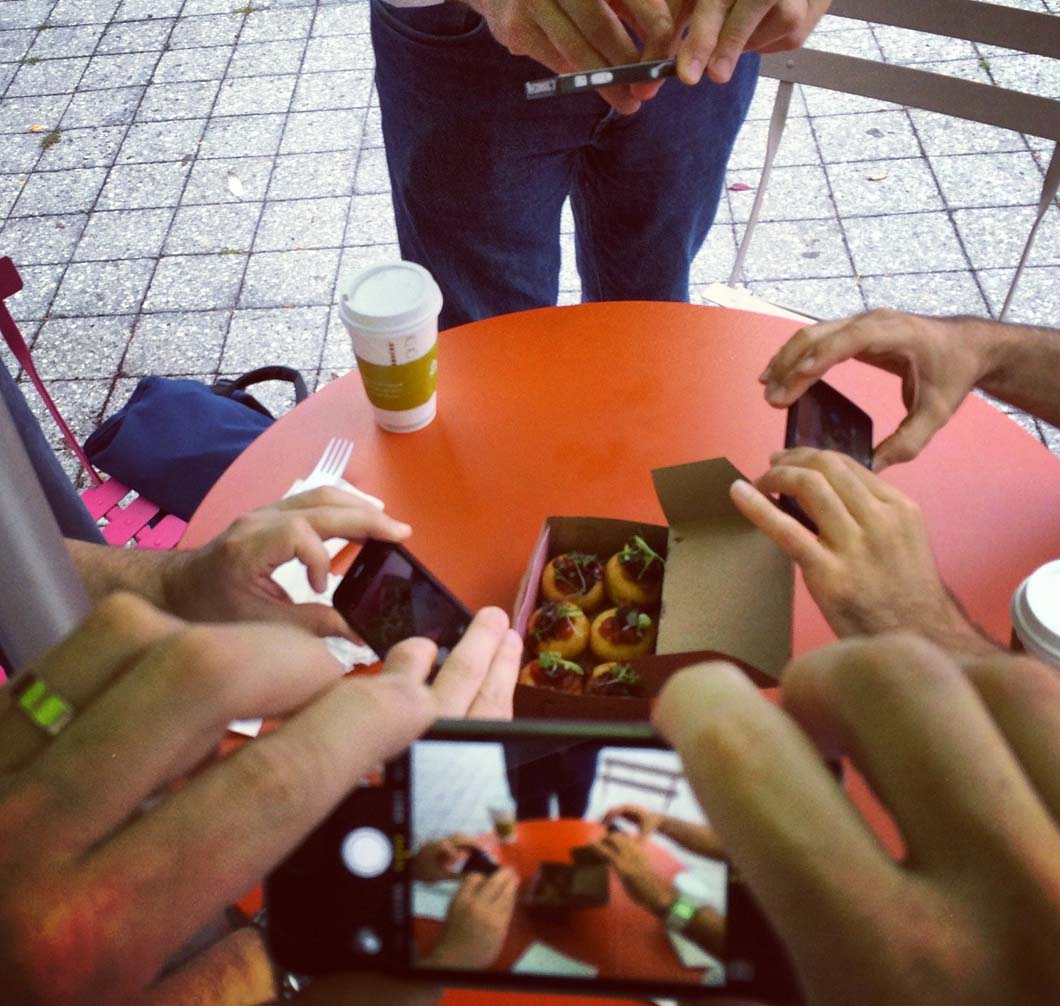
We have been very busy lately in preparation for the upcoming Tau Day. Last week, the whole office gathered around two pies to honor our favorite mathematical constant!