Notebook
Here's where we post periodic updates on what we've been up to at Fathom. Reflections on the interesting stories that emerge from our client work, side projects, after-hours rabbitholes, and other miscellaneous threads of inquiry.
You can also follow these posts as a feed in your feed reader.
If you’re in New York City between now and May 10, stop by the TriBeCa art space, apexart to see the latest Coding the Body exhibit. Organized by friend and former M.I.T. Media Lab professor Leah Buechley, “Coding the Body interrogates the relationship between human and code. It explores how code is being used to understand, control, decorate, and replicate us.” At a time when our lives are increasingly defined by codes—whether written by genetics, religion, or software—Leah's exhibit explores the fascinating, enchanting, and occasionally unnerving relationships that develop between humans and code.
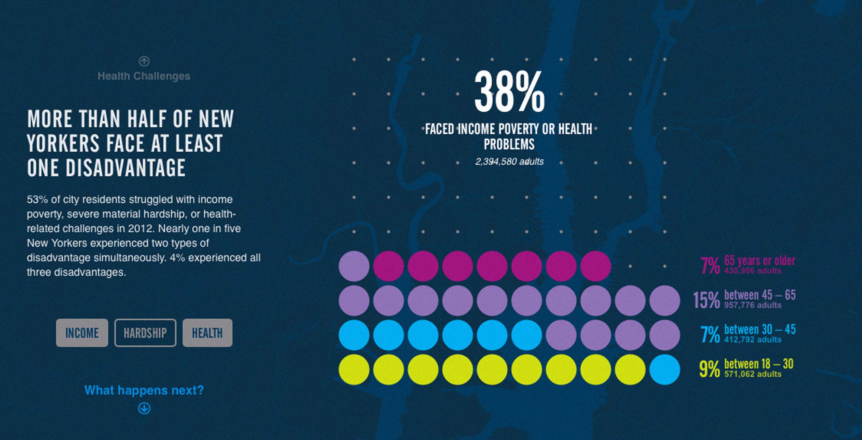
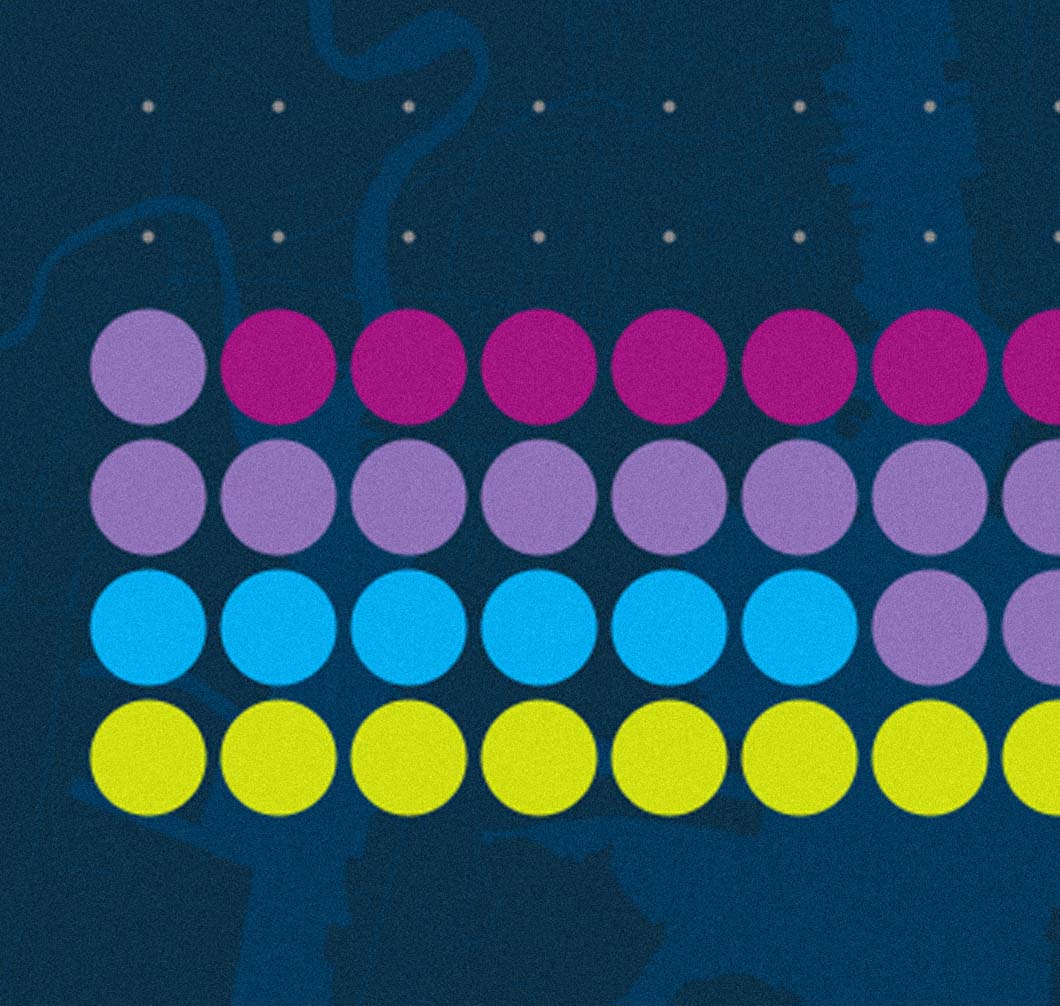
When Robin Hood first came to us with the intent of visually representing poverty and disadvantage in New York City, we were fascinated to learn that our understanding of poverty was based off of an outdated and inaccurate federal measurement. The Poverty Tracker, Robin Hood’s latest initiative, measures financial poverty, material hardship, and health challenges to give a more accurate depiction of what it means to be poor in New York City. In the analysis, construction, and design of this project, we felt it particularly important to remind ourselves throughout the process that we were looking at people—not numbers.
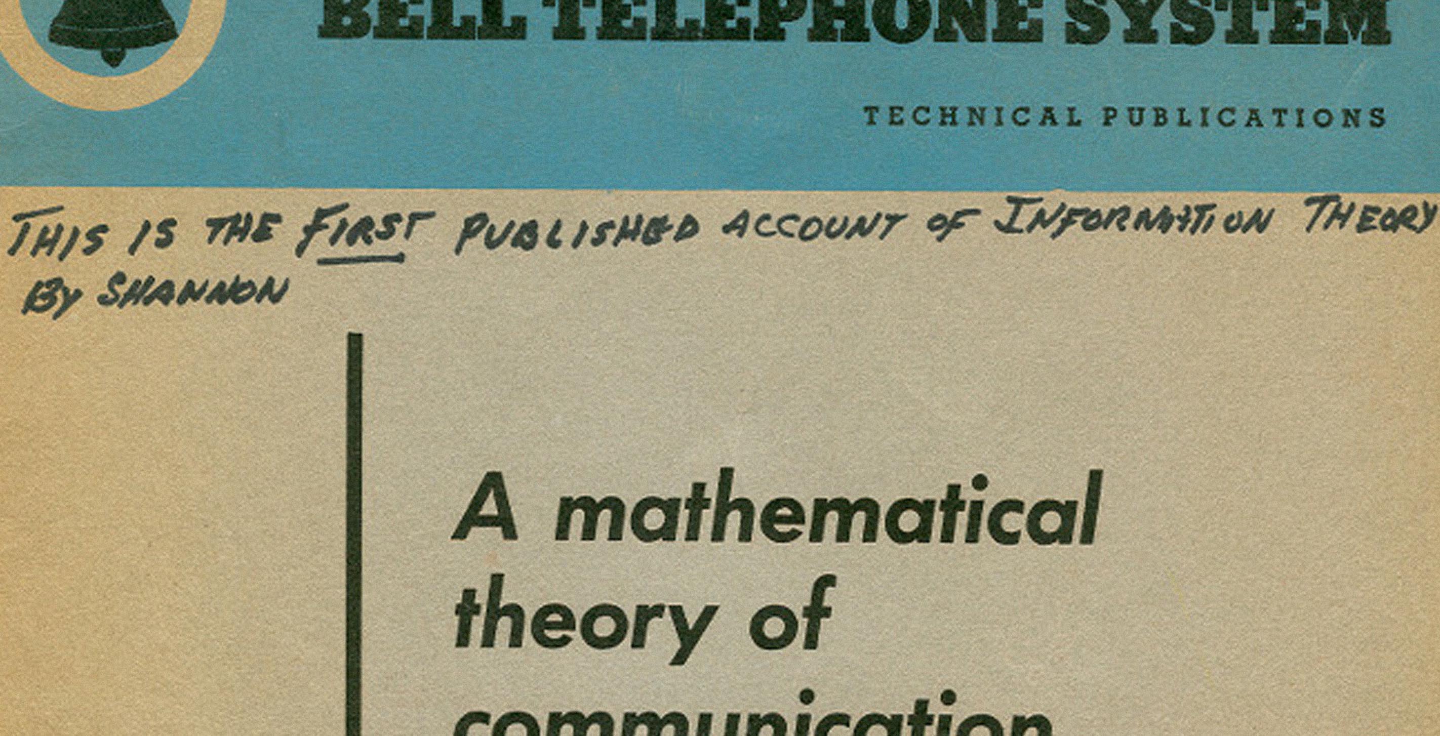
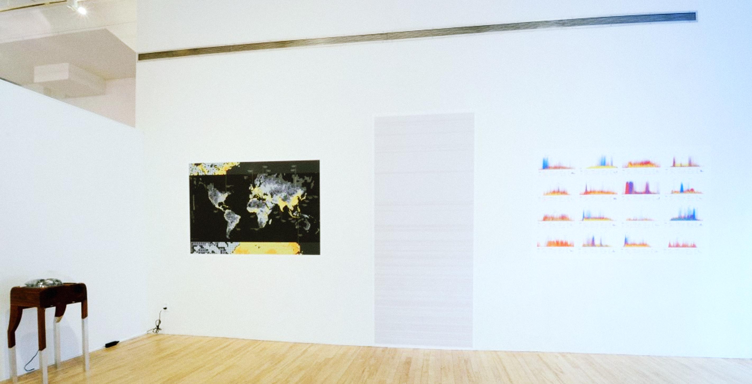
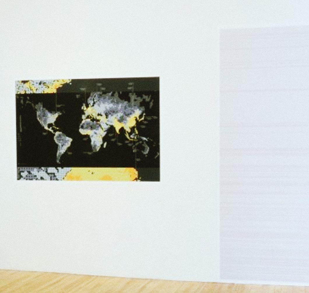
As I mentioned in my previous post, our collaboration with the Sabeti Lab is aimed at creating new visual exploration tools to help researchers, doctors, and clinicians discover patterns and associations in large health and epidemiological datasets. These tools will be the first step in a hypothesis-generation process, combining intuition from expert users with visualization techniques and automated algorithms, allowing users to quickly test hypothesis that are “suggested” by the data itself. Researchers and doctors have a deep familiarity with their data and often can tell immediately when a new pattern is potentially interesting or simply the result of noise. Visualization techniques will help articulate their knowledge to a wider audience. This time around I will describe a quantitative measure of statistical independence called mutual information, which is used to rank associations in the data.
Today is March 20, the official first day of spring, and it almost feels like it. This winter in New England has seemed like one of the toughest in years. The cold and snow have been absolutely relentless, and I think everyone is sick of hearing about the Polar Vortex.
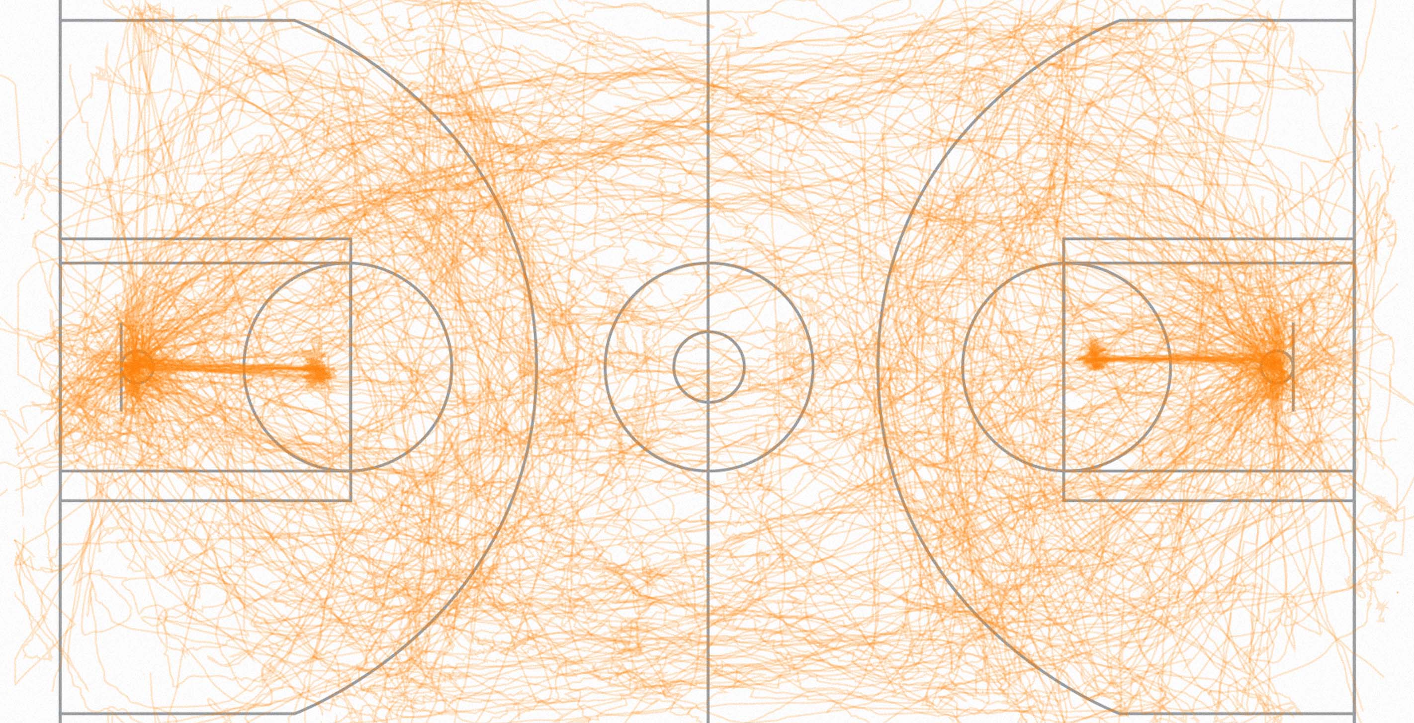
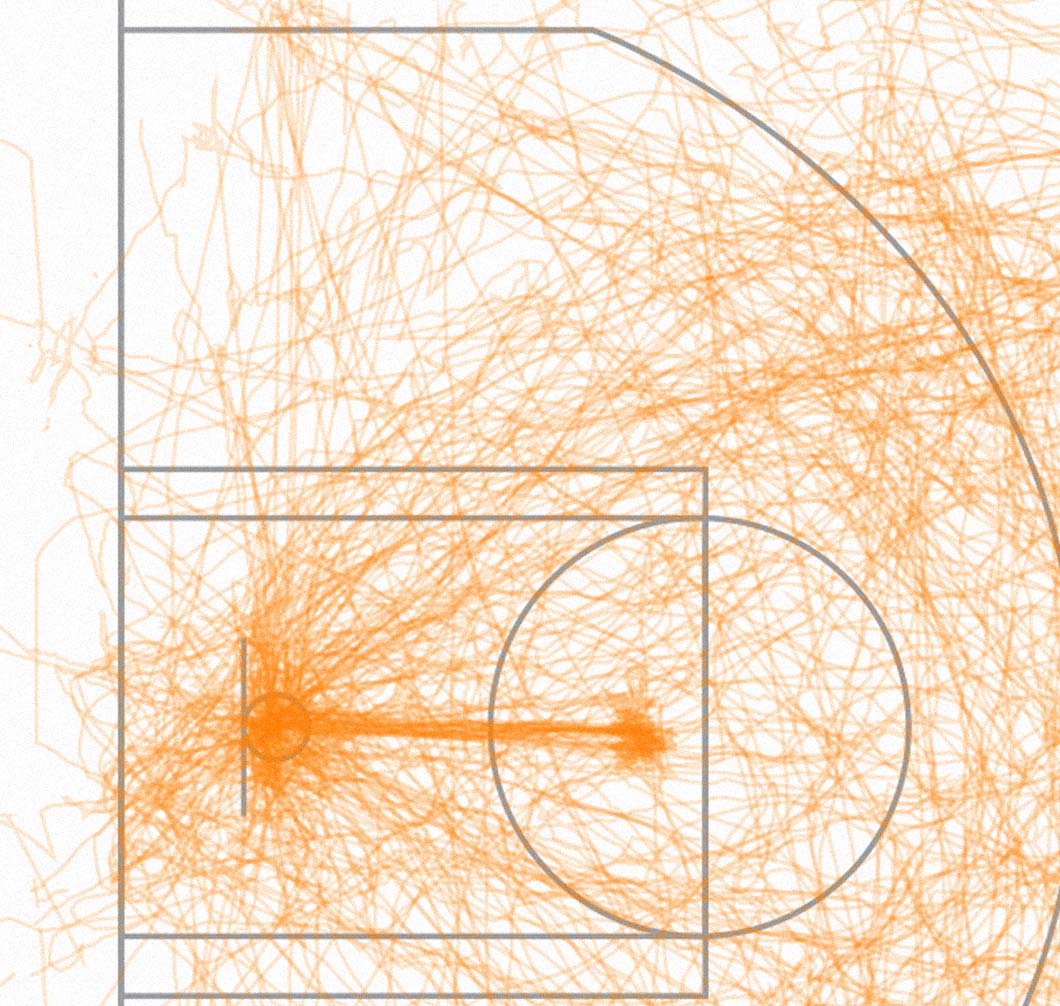
Data, in its multiple forms, can range from the very abstract to the most tangible. We tend to be type-agnostic, but recently a particularly clear set of data caught our eye: real-time position tracking for sports events.
This is a process post about 2013 Year in NikeFuel, but it also serves as an example of our collaborative process at Fathom. You can read the announcement of the project here.
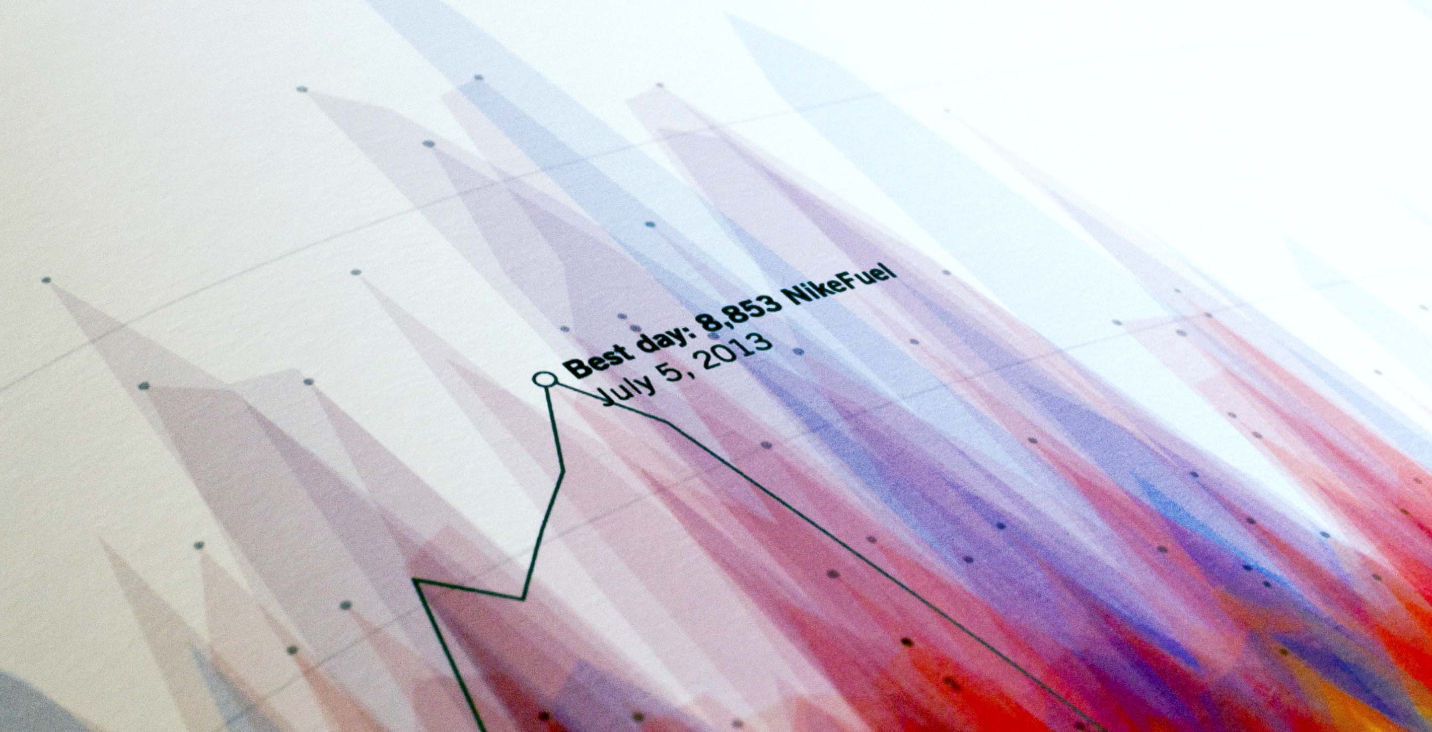
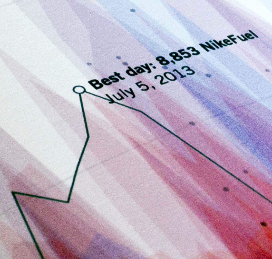
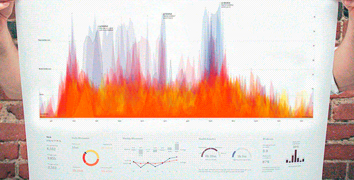
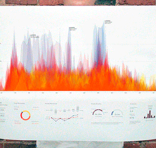
Most of our team at Fathom began wearing Nike+ FuelBands last January. By the end of the year, we had accumulated enough data to start creating interesting code-based sketches of our activity. What emerged from each person's data was a visually unique and telling story of their daily and weekly activity trends. As we fine-tuned the code to encapsulate more users’ information, it became increasingly clear that the portraits represented individualized routines, behaviors, and lifestyles. The exploration evolved into a detailed poster that depicted exercise trends, work routines, and even implications of sleep patterns. Today, those original sketches have graduated into the 2013 Year in NikeFuel, a site built for Nike that allows the entire FuelBand community to see a unique portrait of their personal activity.
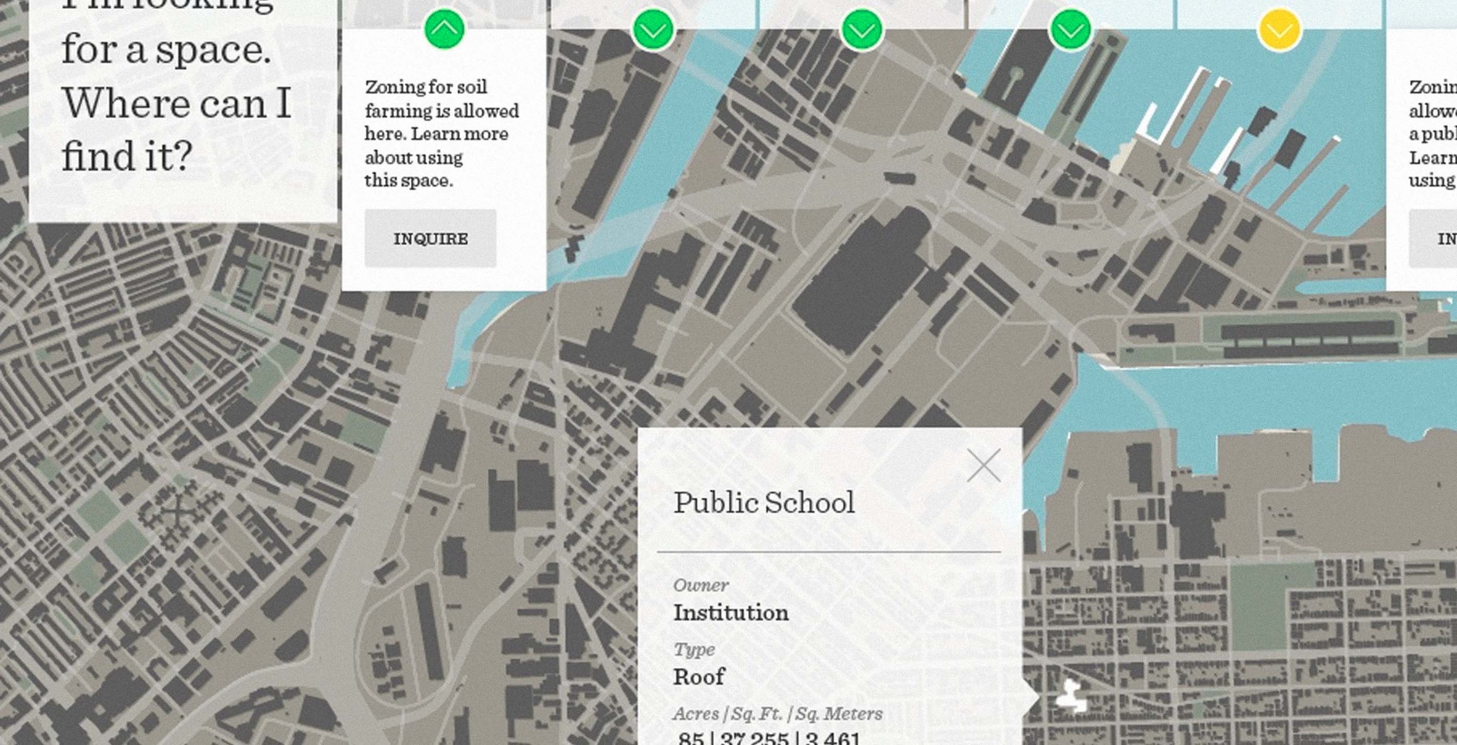
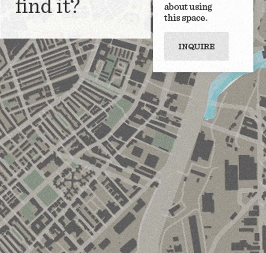
We’re pleased to announce that we’ve been awarded a grant from the Knight Foundation! After working with Knight to navigate the civic tech landscape, we thought they would be a great resource to help us explore a more personal project. The Knight Prototype Fund helps media makers, technologists, and tinkerers take ideas from concept to demo, so it seemed the perfect starting point to bring our latest project on urban agriculture to life.
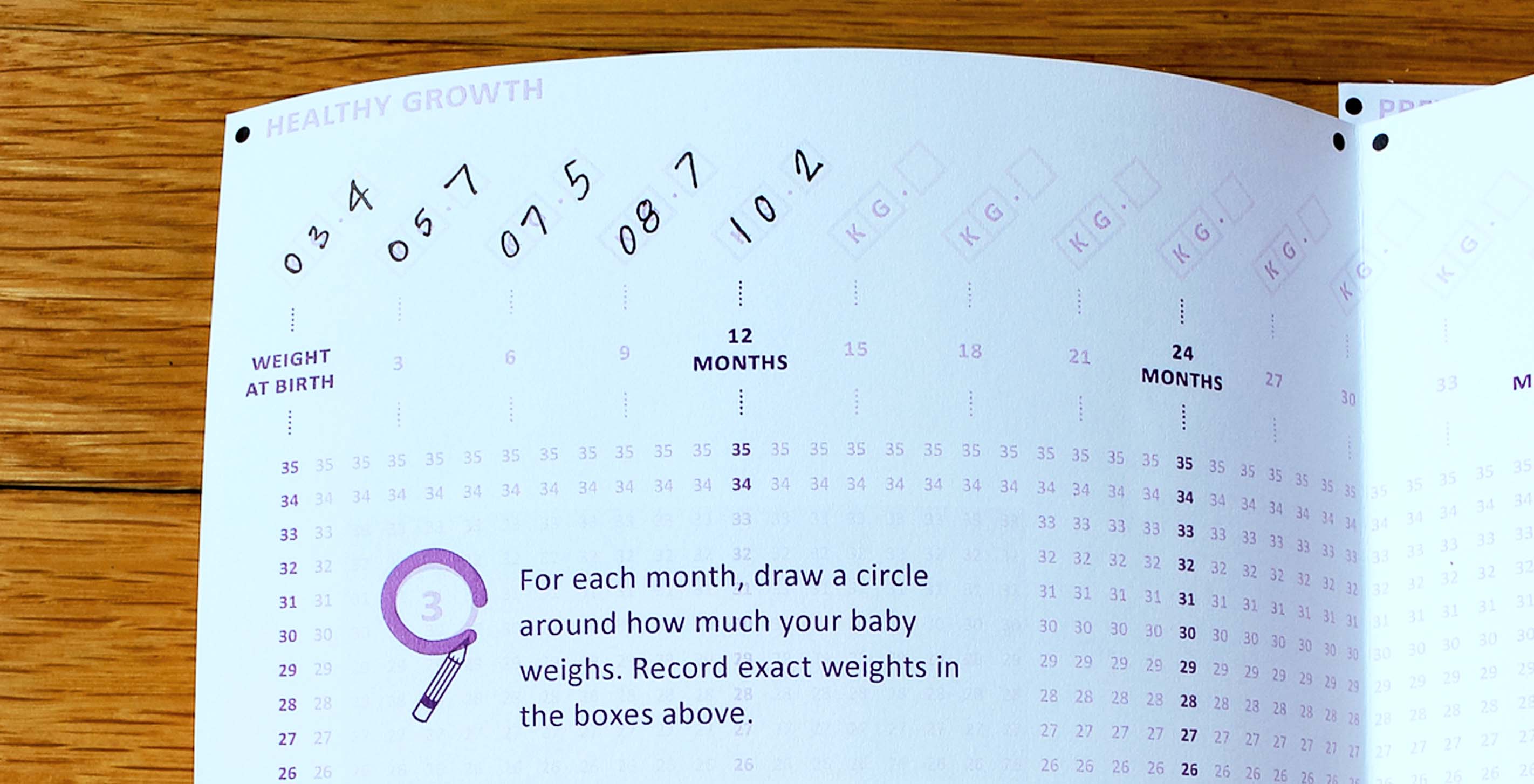
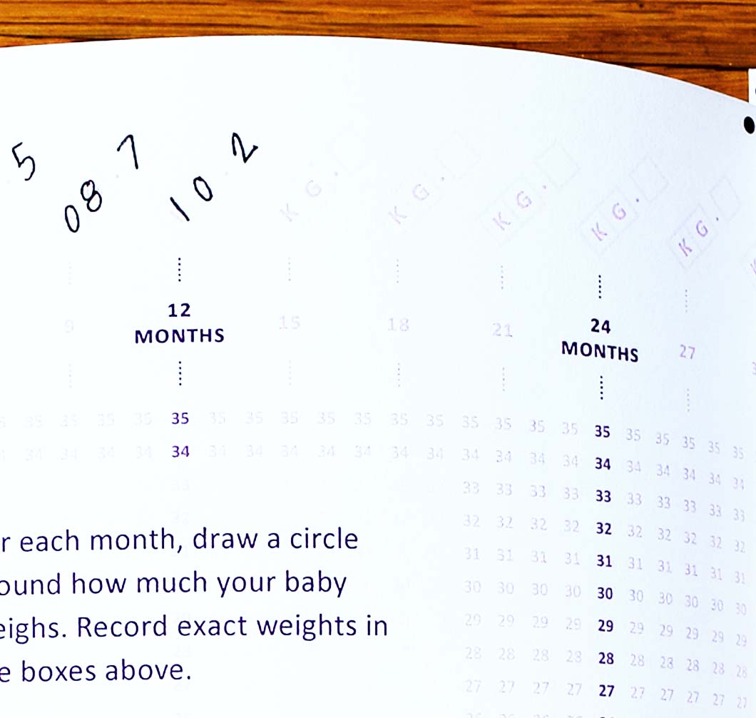
It should come as no surprise that we spend a lot of time geeking out over data. Unless we're busy watching movies, you'll find us exploring existing datasets, and working towards a clear and compelling visual representation of the stories we find inside. Reimagining the child health record as a part of last year's Records for Life contest offered an exciting opportunity to apply those same design concepts to the input mechanisms themselves — both digital and analog — in order to increase the volume and accuracy of global health data.
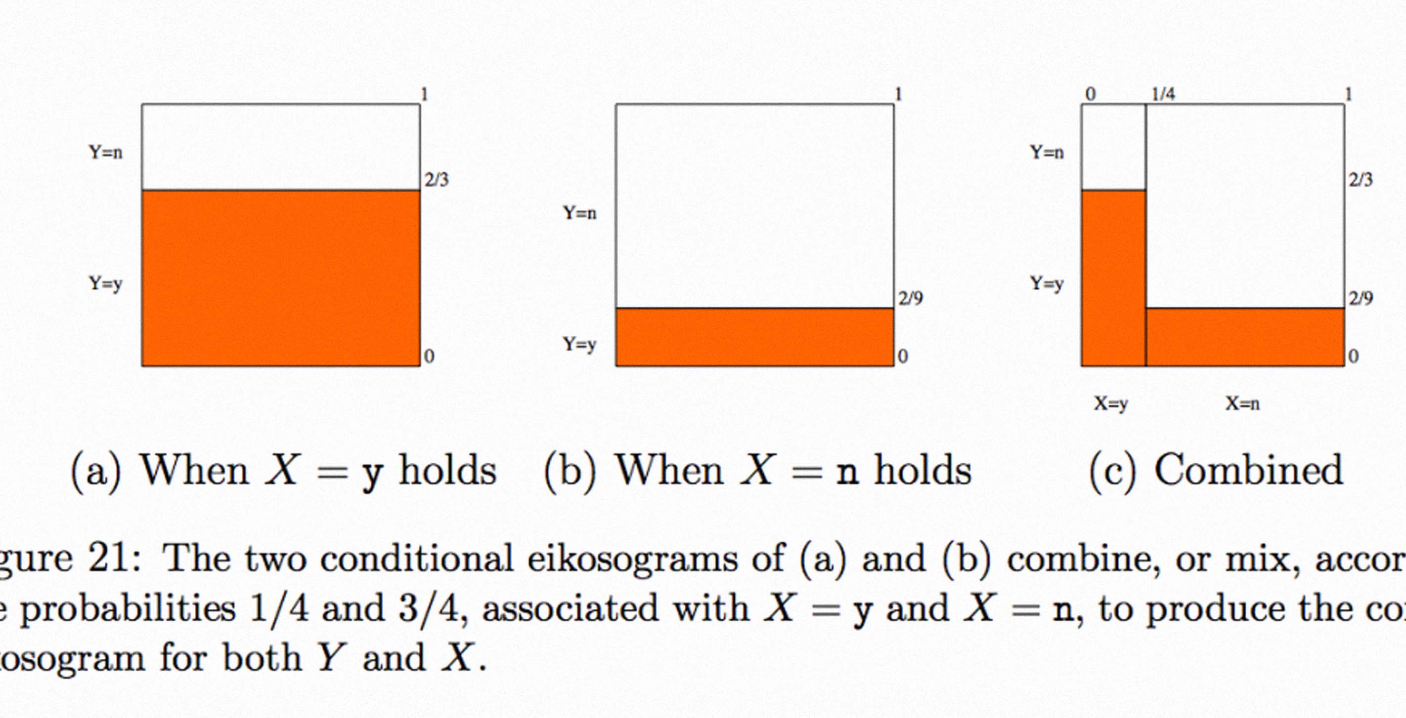
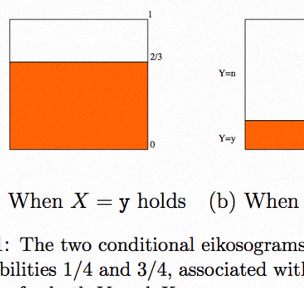
This blog post is motivated by the work I'm carrying out at the Sabeti Lab, which consists of the development of new tools for the visualization of health and genomic information. One of the aims of these tools is to help doctors and researchers find new correlations in their data.